Main navigation
User account menu
Language
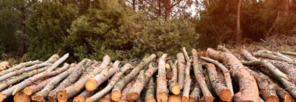
The CO2 fixed by photosynthesis is one of the most important components of the carbon cycle. Forests play a key role in this process. They represent large and persistent carbon sinks. Tree carbon stocks are important to quantify terrestrial carbon storage and carbon sinks, and to estimate potential emissions from land cover changes (deforestation, reforestation, afforestation) and from biotic (pests, diseases) and abiotic (forest fires, windstorms) disturbances. Spatially explicit data and assessments of forest biomass and carbon are thus paramount to design and implement effective sustainable forest management options and forest related policies. The above-ground carbon index presented in this dataset is expressed in Mg (megagrams or tonnes) of carbon per km2 . It corresponds to the carbon fraction of the oven-dry weight of the woody parts (stem, bark, branches and twigs) of all living trees, excluding stump and roots, as estimated by the GlobBiomass project (globbiomass.org) with 2010 as the reference year.

This layer shows the percentage of people with access to any improved sanitation facility, including both piped systems (such as sewer or septic tanks) and non-piped improved options (like ventilated improved pit latrines or composting toilets), in 2017. Improved sanitation is essential for public health, reducing the spread of waterborne diseases and supporting safe and dignified living conditions. Areas with low access highlight the need for expanded basic services and targeted investments in infrastructure.

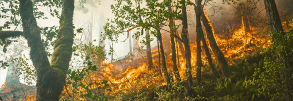
Vegetation fires have become a major concern in Africa because of their negative impacts on the environment and on human welfare. Uncontrolled (and un-prescribed) wildfires cause forest and vegetation degradation and related biodiversity loss, resulting in immediate and long-term impacts on the livelihoods of local communities and upstream impacts on national and regional economies. Fires in the tropical environment are a major contributor to tropical forest degradation and, if too frequent, can lead to savannisation of these areas. Vegetation fires are also a significant source of trace gases and aerosols in the atmosphere and contribute to the anticipated climate change, particularly with emissions of CO2. This layer shows the deviation of dekadal fire occurrences from the long-term average of the same 10-day period. A positive anomaly means more fire events than average for the last full 10-day period (red). A negative anomaly means less fire events than average for the last full 10-day period (green).
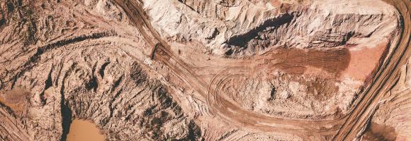
This dataset shows Regional locations and general geologic setting of known deposits of major nonfuel mineral commodities in Africa

The Africa Topographic Potisiont layer classifies the African landscape (including Madagascar, Comoros Islands, and other coastal Islands near continenal Africa) into uplands and lowlands/depressions at a 100m resolution. Published by the USGS in 2009, this dataset was created for the Africa Terrestrial Ecosystems mapping project. The classification is derived from the Compound Topographic Index (CTI) , which integrates slope (from SRTM elevation data) and flow accumulation (from HydroSHEDS data) to model potential water flow.

The African Development Corridors Database (ADCD) is a comprehensive, georeferenced database detailing 79 ongoing and planned investment corridors across Africa, synthesizing data on 184 specific infrastructure projects (railways, ports, pipelines, airports, techno-cities, and industrial parks). Its purpose is to allow for critical assessment of the spatial and temporal impacts of massive infrastructure investments to maximize development opportunities and support the UN Sustainable Development Goals and AU Agenda 2063. The database includes 22 interlinked tabular and spatial attributes with provided sources, which is expected to improve coordination, efficiency, strategic planning, transparency, and impact assessments for governments, investment banks, practitioners, and conservationists, among other stakeholders.

African countries have an evident potential for solar energy. Knowing what amount of solar radiation reaches the earth's surface is of particular interest for solar photovoltaic (PV) installations. It can be represented by the average annual potential energy production (or yield): the total amount of electricity (kWh) produced in one year by a 1 kWp PV system at optimal angle, expressed in kWh/kWp.

Increasing water scarcity and water quality issues are serious constraints, especially for Northern Africa. A comprehensive assessment of spatial and temporal precipitation frequency is the initial step for defining public policies relating to water resources management and environmental monitoring. In the agricultural sector, a detailed knowledge of precipitation patterns is necessary to identify the most appropriate crop varieties for the region and to effectively manage climate related uncertainties. Precipitation frequency is also a central source of information for hazard mitigation and management. This layer represents the average variability of precipitation (L-CV) around the annual mean value for the period 1981-2017. The larger the L-CV, the more variable the annual precipitation is from year to year.
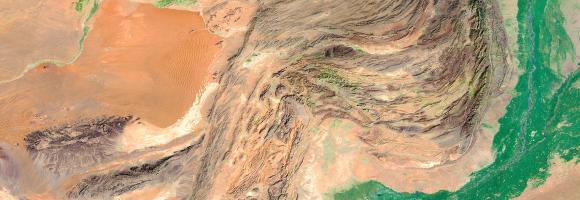
Aridity represents the ‘dryness’ of the climate. Dry areas have a higher potential for land degradation. This layer displays the areas of concern for aridity related issues derived from the convergence of global evidence of human-environment interactions that can lead to land degradation. It highlights dryland areas, where the Aridity Index (ratio of precipitation to evapotranspiration) is inferior to 0.65.
This layer is part of the World Altas of Desertification
Increasing water scarcity and water quality issues are serious constraints, especially for Northern Africa. A comprehensive assessment of spatial and temporal precipitation frequency is the initial step for defining public policies relating to water resources management and environmental monitoring. In the agricultural sector, a detailed knowledge of precipitation patterns is necessary to identify the most appropriate crop varieties for the region and to effectively manage climate related uncertainties. Precipitation frequency is also a central source of information for hazard mitigation and management. This layer shows the average annual precipitation (mm/year) for the period 1981-2017 across the continent.

Map showing the average continental surface temperature of the year 2022. This map was created by interpolating raw monthly satellite data to fill holes in the grids and subsequently adding and averaging the monthly surface temperatures of the year 2022. The data is clipped to only show the African continental region. The raw data is collected during the daytime by the Moderate Resolution Imaging Spectroradiometer (MODIS), an instrument on NASA's Terra and Aqua satellites. Please note that the type of "surface" MODIS measures varies as a function of location. In some places, the measurement represents the skin temperature of the bare land surface. In other places, the temperature represents the skin temperature of whatever is on the land-including snow and ice, or the leafy canopy of forests and crop fields, or human-made structures such as pavement and building rooftops.
Values are expressed in °C.
This dataset is part of the LEAP-RE project collection. For more information visit https://www.leap-re.eu/

Modern energy services are crucial to human well-being and to a country’s economic development; and yet 1.2 billion people are without access to electricity. It is recognized that the central grid is unlikely to reach many remote areas in the near future: many of these communities will have low electricity consumption, making the costs of extending the grid unaffordable. Given the evident potential of solar energy for African countries, using stand-alone and mini-grid photovoltaic (PV) systems could be an alternative approach to meet the objective of universal electrification.
This dataset presents the ratio between the optimized battery size (kWh) and PV array size (kWp) for PV mini-grids using Li-ion batteries to store electricity (instead of traditional lead-acid batteries). It includes layers modeling two distinct usage behaviors:
A higher ratio means that the battery size needed to satisfy the same electricity demand produced by the PV system is larger. Used in combination with other sources, these data can help governments, local authorities, and non-governmental organisations to investigate the suitability of PV mini-grids for the electrification of regions where access to electricity is lacking.
Roots are a long term and stable carbon sink, accounting for about 0.4 of the above ground biomass across biogeographical regions. Well established and developed root systems provide various ecosystem services related to improved soil quality (higher cation exchange capacity and nutrient turnaround) and characteristics (improved soil porosity and aeration). Spatially explicit data and assessments of forest biomass and carbon are paramount to design and implement effective sustainable forest management options and forest related policies. The belowground biomass carbon index (BBCI) presented in this dataset is expressed in Mg (Megagrams or Tonnes) of carbon per km2. It represents an estimation of the carbon stored in the roots of all living trees. Together with the above-ground carbon index (AGCI) and the soil organic content index (SOCI), it provides a complete overview of the total carbon stored in forest areas (trees and soil).
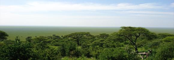
Biodiversity hotspots are the Earth’s most biologically rich—yet heavily threatened—terrestrial regions. These are regions where success in conserving species can have an enormous impact in securing our global biodiversity. To qualify as a biodiversity hotspot, an area must meet two strict criteria: it must contain at least 1,500 species of vascular plants found nowhere else on Earth (known as "endemic" species), and it must have lost at least 70% of its primary native vegetation. 36 regions are identified as hotspots by Conservation International and partners, 9 of which lay (partially or fully) in Africa. This dataset shows their location.
The Biodiversity Intactness Index shows the modelled average abundance of originally-present species in a grid cell, as a percentage, relative to their abundance in an intact ecosystem. Originally available for year 2015, the data is now available in a time series covering the period 2000-2015 - here we provide a bi-decade subset of the index.
Biomes are distinct biological communities (collection of plants and animals) that have formed in response to a shared physical climate. They are distinguished by characteristic temperatures and amount of precipitation. This map shows the geographic distribution of the eleven major terrestrial biomes found in Africa (out of 14 worldwide). It shows that the same biome can occur in geographically distinct areas with similar climates. Annual precipitations, fluctuations in precipitation and temperature variation (on a daily and seasonal basis) are important abiotic factors influencing the geographic distribution of a biome and the vegetation type in the biome.
Biomes are distinct biological communities (collection of plants and animals) that have formed in response to a shared physical climate. The 11 major terrestrial biomes found in Africa (out of 14 worldwide) are partially covered by Protected Areas. This map shows the percentage of areas protected in each of the terrestrial biomes. For example: in 2020, 12,3% of montane grasslands and shrublands in Africa were covered by Protected Areas.
Some extraordinary changes have occurred across the globe over the past decades regarding human habitation. Globally, between 1975 and 2015 built-up areas increased by approximately 250 %, while population increased by a factor of 1.8. The most considerable changes occurred in Africa where it has nearly quadrupled. The extent of built-up area poses a number of challenges to global sustainable development. As urban clusters expand, productive land and soil is sealed, and natural ecosystems are replaced by land use to support urban centres. This layer highlights the areas of concern for built-up related issues derived from the convergence of global evidence of human-environment interactions that can have land degradation consequences.
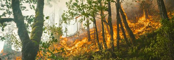
The Copernicus Global Land Service - Burnt Area products depict burn scars, surfaces which have been sufficiently affected by fire to display significant changes in the vegetation cover (destruction of dry material, reduction or loss of green material) and in the ground surface (temporarily darker because of ash). The monthly products are available at global scale in the spatial resolution of 300 m and cover the period from January 2019 to April 2022. The pixel bears the value of the day of the year in which the burn scars were visible while, if selected for mapping in this platform, the dataset shows the burn scars detected in the selected month.
The data provided here are the result of a time-series analysis of carbon density change (in Mg/ha) between 2003-2014 spanning tropical America, Africa, and Asia (23.45 N lat.-23.45 S lat.). The original data is provided as two separate rasters representing (1) carbon density net gain and (2) carbon density net loss within each ~463 x 463 metre pixel, with only pixels exhibiting statistical significance at the 95% level being reported. The data here was re-projected from the its original MODIS sinusoidal projection to WGS84.
During the last twenty years (2000-2020) the intact forest landscapes extent within African, Caribbean and Pacific countries, decreased by 16% (237275km2).
However the protection of IFLs increased in the last two decades. Since 2000, around 100 conserved and protected areas were created in intact forests areas in ACP countries, increasing the percentage of IFL protected from 11% in 2000 to 26% in 2020.. Ethiopia has proposed six protected areas that will cover the total extent of IFL in the country. Republic of Congo increased IFL protection from 15,78% in 2000 to 67,07% in 2020.
| Country | Percentage protected in 2000 | Percentage protected in 2013 | Percentage protected in 2016 | Percentage protected in 2020 |
| Angola | 0.00 | 0.00 | 0 | 0.00 |
| Belize | 90.63 | 92.14 | 91.44447 | 91.99 |
| Cote d'Ivoire | 45.76 | 68.62 | 70.72509 | 82.37 |
| Cameroon | 98.89 | 99.96 | 99.96414 | 99.97 |
| Central African Republic | 14.20 | 39.23 | 47.47338 | 60.00 |
| Congo | 12.65 | 19.72 | 21.21028 | 22.03 |
| Cuba | 15.78 | 59.62 | 63.48035 | 67.07 |
| Democratic Republic of the Congo | 0.00 | 100.00 | 100 | 100.00 |
| Dominican Republic | 0.00 | 98.05 | 98.04902 | 98.05 |
| Equatorial Guinea | 1.07 | 0.00 | 0 | 0.00 |
| Ethiopia | 5.23 | 27.32 | 28.38109 | 29.74 |
| Gabon | 36.57 | 66.72 | 72.62826 | 73.61 |
| Guyana | 2.89 | 12.50 | 12.99736 | 13.25 |
| Liberia | 29.30 | 43.19 | 43.42341 | 54.63 |
| Madagascar | 34.84 | 39.28 | 37.74979 | 91.96 |
| Nigeria | 88.66 | 89.20 | 89.64465 | 91.54 |
| Papua New Guinea | 2.36 | 3.50 | 3.627328 | 4.61 |
| Samoa | 0.00 | 0.00 | 0 | 2.29 |
| Solomon Islands | 11.64 | 16.82 | 17.09852 | 18.69 |
| Suriname | 83.56 | 86.31 | 85.87311 | 95.55 |
| Uganda | 96.84 | 97.64 | 97.85507 | 98.25 |
| United Republic of Tanzania | 2.02 | 1.91 | 1.906882 | 1.92 |
| Vanuatu | 0.00 | 14.54 | 14.54262 | 14.48 |
Analysis performed by Simona Lippi
Reference:
Potapov, P., Hansen, M. C., Laestadius L., Turubanova S., Yaroshenko A., Thies C., Smith W.,
Zhuravleva I., Komarova A., Minnemeyer S., Esipova E. “The last frontiers of wilderness: Tracking loss of
intact forest landscapes from 2000 to 2013” Science Advances, 2017; 3:e1600821
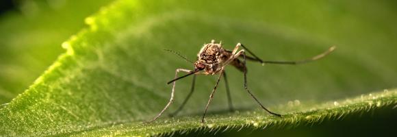
Malaria, a life-threatening disease transmitted by mosquitoes, affects millions of people worldwide. Treatment and prevention efforts such as insecticide-treated mosquito nets and rapid diagnostic tests significantly decreased the number of malaria cases in Africa. This layer displays the change in malaria rates (%) from 2000 to 2015 among children in Sub-Saharan Africa.
''Intact Forest Landscapes (IFLs) are defined as those with an unfragmented area of at least 500 km2 and which are minimally influenced by human economic activity''.(Thies et al. 2011) IFLs are critical for stabilizing terrestrial carbon storage, harboring biodiversity, regulating hydrological regimes, and providing other ecosystem functions. Researchers, firstly, created a global IFL map using existing fine-scale maps and
a global coverage of high spatial resolution satellite imagery (Potapov et al. 2008). Moreover they assessed the distribution and dynamics of IFLs within the extent of present-day forest ecosystems tracking loss of intact forest landscapes from 2000 to 2020. In this layer we show the reduction of the IFL extent for African, Caribbean and Pacific (ACP)countries that decreased by 16,6% since the year 2000. Countries that experienced the largest reduction in intact forest landscape area over the past two decades are Solomon Islands with 66,3 %, Central African Republic with 57% and Equatorial Guinea with 50,4%. Democratic Republic of the Congo still has the highest proportion of intactness of ACP countries with 59,7Mha. IFL in Democratic Republic of the Congo has an extent of 64,3Mha as the 27,7% of its forest cover.
| Country | IFL Area in 2000 (sqkm) | IFL Area in 2020 (sqkm) | Percentage of IFL reduction |
| Angola | 2913.32 | 1752.85 | 39.83 |
| Belize | 4275.28 | 3598.44 | 15.83 |
| Cote d'Ivoire | 4558.78 | 3760.48 | 17.51 |
| Cameroon | 52752.96 | 31968.77 | 39.40 |
| Central African Republic | 8695.96 | 3727.14 | 57.14 |
| Congo | 138699.28 | 100215.44 | 27.75 |
| Cuba | 544.02 | 544.02 | 0.00 |
| Democratic Republic of the Congo | 643864.37 | 597275.75 | 7.24 |
| Dominican Republic | 795.21 | 564.89 | 28.96 |
| Equatorial Guinea | 4249.57 | 2104.83 | 50.47 |
| Ethiopia | 3671.63 | 3233.76 | 11.93 |
| Gabon | 108838.30 | 76291.78 | 29.90 |
| Guyana | 144296.97 | 117327.95 | 18.69 |
| Liberia | 4748.74 | 2880.65 | 39.34 |
| Madagascar | 17240.16 | 10799.08 | 37.36 |
| Nigeria | 2959.07 | 2416.10 | 18.35 |
| Papua New Guinea | 159523.52 | 127121.71 | 20.31 |
| Samoa | 650.86 | 643.16 | 1.18 |
| Solomon Islands | 7820.33 | 2630.05 | 66.37 |
| Suriname | 107282.59 | 92574.26 | 13.71 |
| Uganda | 984.66 | 962.06 | 2.30 |
| United Republic of Tanzania | 4081.92 | 3796.32 | 7.00 |
| Vanuatu | 706.13 | 688.33 | 2.52 |

Percentage of children 24-35 months who had received all age appropriate vaccinations. The lower the number of vaccinated children, the more beneficial decentralised renewable energy solutions may be in providing electricity to store vaccines in proper refrigerators.
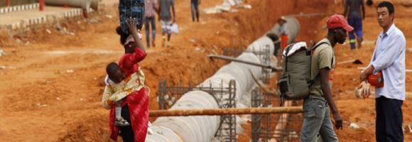
How do development projects influence the geographic distribution of economic activity within low-income and middle-income countries? Existing research focuses on the effects of Western development projects on inter-personal inequality and inequality across different subnational regions. However, China has become a major financier of economic infrastructure in Africa. This dataset geo-locates Chinese Government-financed projects between 2000 and 2014. It captures 3,485 projects worth $273.6 billion in total official financing. It includes both Chinese aid and non-concessional official financing. Chinese development projects in general, and Chinese transportation projects in particular, appear to reduce economic inequality within and between subnational localities.
Changes in vegetation biomass are critical in assessing land degradation. Climate variations, alone or in combination with human-induced land use and land change, can affect biomass productivity and may trigger changes in vegetation type and structure. Depending on their severity and duration, precipitation anomalies can trigger or aggravate existing land pressures. This layer displays the areas of concern for climate-vegetation trends derived from the convergence of global evidence of human-environment interactions that can have consequences on land degradation. It highlights areas with declining plant productivity in response to climate fluctuations (drought conditions in particular).
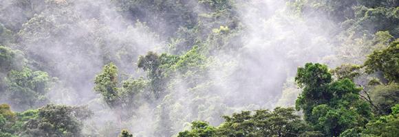
Côte d'Ivoire and Ghana are the main largest producers of cocoa in the world. However, the cultivation of this crop has led to the loss of vast tracts of forest areas in both countries. Efficient and accurate methods for remotely identifying cocoa farms are essential for the implementation of sustainable cocoa practices and the periodic and effective monitoring of forests. This map, generated using Random Forest image classification, shows the 2019 distribution of cocoa farms in both countries. The estimated area for cocoa is 4.8Mha for Cote d'Ivoire and 2.3Mha for Ghana.

Percentage of cohort of young people three to five years older than the intended age for the last grade of upper secondary level of education who have completed that level of education. This indicator measures the potential impact of electricity on youth education, that represents a crucial pillar for the development of a country.
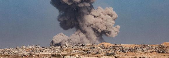
An intact forest landscape (IFL) is a seamless mosaic of forest and naturally treeless ecosystems with no remotely detected signs of human activity and a minimum area of 500 km2. (Potapov et al.2017) Intact forests are complex and diverse ecosystems that if lost, are irreplaceable. Research shows that designating intact forest landscapes as protected areas has proven effective at limiting their fragmentation. Since 2000, around 100 conserved and protected areas were created in intact forests areas in ACP countries, increasing the percentage of IFL protected from 11% in 2000 to 26% in 2020.
Differences in countries in terms of IFL area reduction: Cuba has not experienced any reduction in IFLs and nowadays its intact forests are fully protected by PAs (544sqkm). At the contrary Angola still not has any kind of protection for its IFLs and experienced a reduction of 39,83% of its IFL (1160 sqkm) in country.The reduction of IFL area in ACP countries was higher outside PAs (19%) than within PAs (5%).Madagascar is the country where the reduction of IFL areas was very high inside protected areas (2420 sqkm). The IFL loss inside PAs has been more than 40% between 2000 and 2020. Central African Republic experienced 23% of reduction inside PAs (938,13 sqkm). This layer shows the percentage of IFLs protected by country
| Country | IFL protected 2020 (sqkm) | IFL unprotected 2020 (sqkm) | Percentage of IFL protected 2020 | Percentage of IFL unprotected 2020 |
| Angola | 0.00 | 1752.85 | 0.00 | 100.00 |
| Belize | 3310.17 | 288.36 | 91.99 | 8.01 |
| Cameroon | 19181.16 | 12787.52 | 60.00 | 40.00 |
| Central African Republic | 3070.21 | 656.90 | 82.37 | 17.62 |
| Congo | 67218.88 | 32997.23 | 67.07 | 32.93 |
| Cote d'Ivoire | 3759.21 | 1.27 | 99.97 | 0.03 |
| Cuba | 544.02 | 0.00 | 100.00 | 0.00 |
| Democratic Republic of the Congo | 131588.22 | 465687.18 | 22.03 | 77.97 |
| Dominican Republic | 553.86 | 11.03 | 98.05 | 1.95 |
| Equatorial Guinea | 1549.39 | 555.44 | 73.61 | 26.39 |
| Ethiopia | 0 | 3233.7 | 0 | 100 |
| Gabon | 22692.90 | 53598.80 | 29.74 | 70.26 |
| Guyana | 15545.93 | 101781.93 | 13.25 | 86.75 |
| Liberia | 1573.69 | 1306.95 | 54.63 | 45.37 |
| Madagascar | 9931.34 | 867.74 | 91.96 | 8.04 |
| Nigeria | 2211.75 | 204.39 | 91.54 | 8.46 |
| Papua New Guinea | 5863.48 | 121258.17 | 4.61 | 95.39 |
| Samoa | 93.13 | 550.03 | 14.48 | 85.52 |
| Solomon Islands | 60.11 | 2569.93 | 2.29 | 97.71 |
| Suriname | 17304.85 | 75269.36 | 18.69 | 81.31 |
| Uganda | 945.21 | 16.84 | 98.25 | 1.75 |
| United Republic of Tanzania | 3627.46 | 168.85 | 95.55 | 4.45 |
| Vanuatu | 13.24 | 675.08 | 1.92 | 98.08 |
Analysis performed by Simona Lippi
At any given place on Earth, complex human-environment interactions are at play. They include differing rates and magnitudes of drivers (e.g. overgrazing, climate change, agricultural practices) and differing consequences in land degradation (e.g. soil erosion, changes in productivity, loss of biodiversity). The occurrence of multiple global change issues at a location suggests a potential for land degradation, at least in some form. This layer depicts where global change issues relevant to land degradation coincide at a global scale. It helps identifying local or regional areas of concern where land degradation processes may be underway.
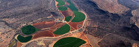
Whether you’re monitoring crops, modelling green energy installations or soil sealing, combatting loss of natural resources or just helping countries meet their Sustainable Development Goals, chances are high that you’ll need an accurate and spatially detailed map on land cover and land use. Earth Observation satellites, like those from EU’s flagship programme Copernicus, are key to providing such maps, at a global scale, with free and open access. Land cover maps represent spatial information on different types (classes) of physical coverage of the Earth's surface, e.g. forests, grasslands, croplands, lakes, wetlands. Dynamic land cover maps include transitions of land cover classes over time and hence captures land cover changes. This dataset shows the land cover for the baseline year 2019 with a discrete classification in 23 classes aligned with UN-FAO's Land Cover Classification System.
Park managers in many countries across Africa need to monitor and understand their parks features and overall health. They can rely on the highly detailed land cover information offered by the Copernicus Hot Spot Land Cover Change Explorer for specific areas of interest –or hot spots. These areas were selected for their importance in biodiversity preservation (Protected Areas, Key Landscapes for Conservation...). For each land cover class (Natural vegetation, Wetlands, urbane areas, etc.), this layer shows which portions of the areas changed to another class over the period (2000-2019). For a more detailed analysis, compare the layer with the present landcover or refer to the online Explorer. The allows to monitor land cover and land cover change in high detail and make informed decisions based on spatial data.
Copernicus is the European flagship programme for monitoring the Earth. Data is collected by Earth observation satellites and sensors on the earth’s surface. The Copernicus Land Monitoring Service provides geographical information on land use and land cover at European and global scale. Derived from the Copernicus Hot Spot Land Cover Change Explorer, this layer presents detailed land cover information for specific areas of interest –or hot spots– in Africa. These areas were selected as a priority for mapping because of their importance in biodiversity preservation (Protected Areas, Key Landscapes for Conservation...). Park managers in many countries across Africa rely on this Copernicus product to monitor and understand their parks features and overall health. Mapping habitats, assessing pressure on land, identifying prime locations for species reintroduction or new areas to protect are just a few examples of how these data can be exploited.
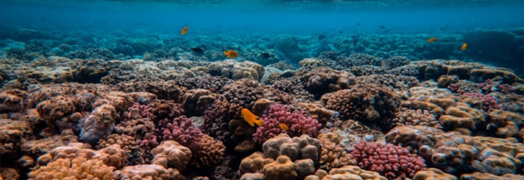
Healthy coral reefs provide a home for millions of aquatic species. They protect coastal homes from storms and support commercial and subsistence fisheries as well as jobs and businesses through tourism and recreation. Yet they are severely threatened by pollution, disease, habitat destruction and climate change. When corals are stressed, they expel the symbiotic algae living in their tissues and become white (bleached) and vulnerable. Corals are vulnerable to bleaching when the sea surface temperature (SST) exceeds the temperatures normally experienced in the hottest month of the year. The NOAA Coral Reef Watch daily global 5km Coral Bleaching HotSpot product measures the occurrence and magnitude of instantaneous heat stress, potentially resulting in coral bleaching. It highlights regions where the SST is warmer than the highest monthly mean. HotSpot values of 1°C or more indicate heat stress leading to coral bleaching and are highlighted in yellow to dark red colors.

This dataset is an index that estimates the relative value provided by coral reefs that protect coastlines through reduction of wave height and wave energy. The value as of 2014 is modelled as a function of exposed populations and infrastructure that received some level of protection from coastal and barrier reefs, and is described in relative terms, classified by decile (i.e., grouped into the most valuable ten percent of reefs for protection, the second-most valuable tenth of reefs, etc.). It was calculated at 1 kilometre (km) resolution globally, encompassing all countries and territories containing coral reefs.

Despite a high total population, most parts of the African continent are sparsely populated, with almost 60% living in non-urban areas. Diesel generators have long been the traditional solution to decentralized electrification needs. For off-grid applications, they present lower up-front capital costs per kilowatt installed; however, the dramatic increase of fuel costs in recent years and the cost of transport to remote areas greatly diminish the low capital cost advantage of the diesel option. Even in the cases when the initial investments were subsidized, the high yearly fuel cost are born by the users which often results in early termination of its use. The map shows the spatial variance of the electricity costs per kWh delivered by an off-grid diesel generator.
Modern energy services are crucial to human well-being and to a country’s economic development. Yet 1.2 billion people worldwide live without access to electricity. It is recognized that the central grid is unlikely to reach many remote areas in the near future: many of these communities will have low electricity consumption, making the costs of extending the grid unaffordable. Given the evident potential of solar energy for African countries, using stand-alone and mini-grid photovoltaic (PV) systems could be an alternative approach to meet the objective of universal electrification. This layer compares the costs of electricity produced by solar photovoltaic and diesel systems, the two prevailing off-grid options for rural electrification in Africa. The map shows the difference between solar- and diesel-based electricity production cost (cents USD/kWh) at one square-kilometre resolution. PV minigrid represent the least-cost electrification option in the orange-to-yellow areas, whereas cheaper diesel is depicted in purple. The higher the contrast, the larger the cost difference.
Africa is very rich in biodiversity and is the last place on Earth with a significant assemblage of large mammals. This natural richness, accumulated over millions of years, coupled with the wealth of indigenous and local knowledge on the continent, is central to the pursuit of sustainable development in the region. Yet the decline and loss of biodiversity is reducing nature’s contributions to people in Africa, affecting daily lives and hampering the sustainable social and economic targets set by African countries. This map shows the number of threatened mammal species by country, assessed by the International Union for the Conservation of Nature (IUCN) and documented in the IUCN Red List of Threatened Species. Established in 1964, the IUCN Red List is a critical indicator of the health of the world’s biodiversity that helps inform necessary conservation decisions.
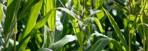
Crop conditions monitoring is highly relevant for food security early warning and response planning in food-insecure areas of the world. GEOGLAM (the Group on Earth Observations' Global Agricultural Monitoring Initiative) aims to reinforce the international community's capacity to produce and disseminate relevant, timely, and accurate forecasts of agricultural production at national, regional, and global scales using Earth Observation data.
Copernicus4GEOGLAM, one of the Copernicus Land Monitoring Services managed by the EC Joint Research Centre, aims to produce baseline information that allows countries in Africa to improve their agricultural monitoring systems.
This dataset aggregates crop maps requested by three East African nations, showing the agricultural situation at the end of the long rain season of 2021. The results are made fully and freely accessible, covering the following areas:
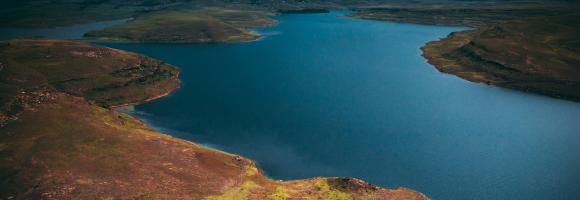
Water Footprint in Africa, considered as the sum of both the green and blue WF and defined as the ratio between evapotranspiration (in m3 per hectare) and crop yield (in ton per hectare). The values are expressed in m3/ton.
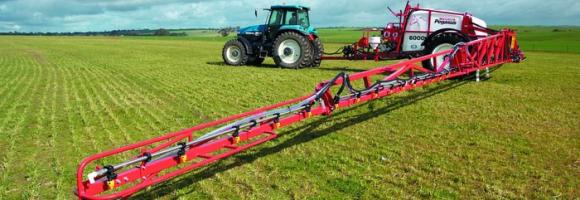
By detecting areas where agricultural production deficits might occur, it is possible to prevent food security crises and anticipate response planning. To do this, we need accurate and reliable information on agricultural land cover. This layer shows the extent of cropland in Africa. Each pixel represents the fraction of the area covered by cropland (i.e. the percentage of the pixel with crops).
Healthy coral reefs provide a home for millions of aquatic species and numerous ecosystemic services. Yet they are severely threatened. When stressed, corals expel the symbiotic algae living in their tissues and become white (bleached) and vulnerable. The NOAA Coral Reef Watch daily global 5km satellite coral Bleaching Alert Area (7-day maximum) is a composite product that summarizes the current Degree Heating Week (a cumulative measurement of both intensity and duration of heat stress) and Coral Bleaching HotSpot (occurrence and magnitude of instantaneous heat stress) values. At a glance, this layer outlines the current locations, coverage, and potential risk level of coral bleaching heat stress.
The Dead Wood Carbon and Litter Carbon pools have been estimated at global level as constant fractions of ESA Biomass CCI Above Ground Biomass (AGB), v.3 (2018) using a lookup table based on global ecological zone, elevation and precipitation regime, as proposed by Harris, N.L., Gibbs, D.A., Baccini, A. et al. Global maps of twenty-first century forest carbon fluxes. Nat. Clim. Chang. 11, 234–240 (2021). https://doi.org/10.1038/s41558-020-00976-6
Humans need increasingly more biomass for food, fodder, fibre and energy. Meeting these demands changes global ecosystems. Tracking changes in total biomass production or land productivity is an essential part of monitoring land transformations that are typically associated with land degradation. Land productivity dynamics (LPD) are used as an indicator of change or stability of the land’s capacity to sustain primary production. This layer displays the areas of concern for land productivity related issues, derived from the convergence of global evidence of human-environment interactions that can have consequences on land degradation.
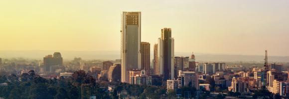
The layers present the application of the Degree of Urbanisation stage I methodology recommended by UN Statistical Commission to the global population grid generated by the JRC in the epochs 1975-2030 (5 years timestep). They have been generated by integration of built-up surface extracted from Landsat and Sentinel-2 image data processing (GHS-BUILT-S R2023), and population data derived from the CIESIN GPW v4.11 (GHS-POP R2023). This product is an update of the data released in 2022 based on the updates of the GHS-BUILT-S and GHS-POP. The Settlement Model is provided at the detailed level (Second Level - L2). First level can be obtained aggregating L2.

Distance from existing or planned electric grid lines (LV; MV; HV).
Unit: km
This dataset provides a continent-wide, raster-based spatial representation of Earth's surface heat flow across the African tectonic plate for the year 2013, modeled under a historical baseline scenario. The data quantifies the amount of thermal energy moving from the Earth's interior to its surface, with values explicitly expressed in watts per square meter (W/m²). This resource is critical for identifying geothermal potential, understanding tectonic anomalies, and supporting broader geoscientific and energy research.
Sources and ContextThis layer is part of the Geothermal Atlas for Africa developed within the LEAP-RE project

Percentage of children aged 6-8 that currently attends, or in the current school year attended, school. This indicator measures the potential educational impact of bringing electricity to schools; therefore, the impact of binging electricity will be higher where the educational attendance is low.

Percentage of schools in Africa reporting to have no electricity. The lower the education facilities with access to electricity the greater the potential for decentralised renewable energies to improve electricity access in these facilities and thus educational outcomes.

Poverty affects billions of people around the globe. On a daily basis, they face low wages and substandard health, education, and living standards. Because of this, poverty must be understood and approached as a multidimensional issue. The Multidimensional Poverty Index (MPI) acknowledges that poverty has many faces. The second dimension in the MIP is the Education dimension. This includes years of schooling and child school attendance. This map shows the percentage contribution of the education dimension to overall poverty. The lower percentages are shown in darker blues while the higher percentages are shown as brighter, lighter blues.
This layer provides the Effective Leaf Area Index (LAIe), a critical parameter for modeling evapotranspiration and carbon fluxes between the biosphere and the atmosphere. Monitoring the distribution and seasonal evolution of LAI is essential for assessing vegetation health and ecosystem dynamics across Africa.
The Effective Leaf Area Index is a quantitative measure of the amount of live green leaf material present per unit ground surface. Unlike "True LAI," which represents the total physical leaf area, the Effective LAI is derived from canopy gap fraction measurements and assumes a random distribution of foliage. It is a non-dimensional quantity, typically expressed in units of m²/m².
This dataset is widely utilized in agro-meteorology, biogeochemical modeling, and General Circulation Models (GCMs) to parameterize vegetation cover and its complex interactions with the atmosphere.
This layer is part of the Earth Land Information System (ELIS).
This layer presents the Effective Leaf Area Index (LAIe) Anomalies, representing the deviation of current vegetation density from the historical average. Monitoring the change of LAI is essential for assessing the evolution of the vegetation over Africa.
LAI anomalies are calculated relative to the average values between 2003 and 2010. The dataset captures LAI anomalies every 10 days, reflecting the high variability and rapid changes in African vegetation cover. Increases in temperature and precipitation deficits are the primary drivers for negative anomalies (reduced foliage density). Beyond climatic factors, human activities or animal grazing may also locally impact the state and density of leaves.
This layer is part of the a href="https://fapar.jrc.ec.europa.eu/_www/index.php">Earth Land Information System (ELIS).
This layer represents the predicted likelihood that a given settlement is electrified, with values ranging from 0 (no electricity) to 1 (fully electrified). The data are derived from the High Resolution Electricity Access (HREA) dataset, which combines satellite observations of night-time lights with population settlement layers to estimate electricity access. Areas with low predicted electrification can help identify where decentralized renewable energy solutions may be most impactful in closing electricity access gaps.

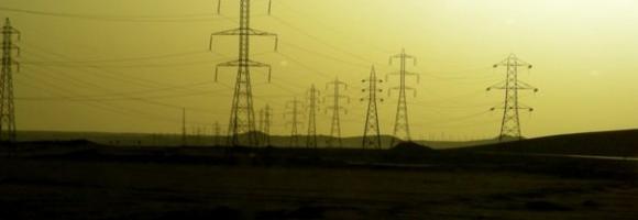
In Sub-Saharan Africa, medium- and low-voltage data are often non-existent, uncompleted, or unavailable. This is a challenge for practitioners working on the electricity access agenda, power sector resilience or climate change adaptation. This layer presents the spatial extent of the existing and planned electricity grid (high, medium, low voltage level) compiled using multiple sources that enumerate elements of the existing transmission and distribution network.

Percentage of women who worked in the 12 months preceding the survey and are working currently. A lower score reflects weaker female emancipation within the labour market, and thus a higher potential impact of electricity access for improving women empowerment.

Displays areas where the geographic range of two or more endemic bird species overlaps. While many bird species are widespread, over 2,500 are endemic and restricted to an area smaller than 5 million hectares (restricted-range species). BirdLife International has mapped every restricted-range species using geo-referenced locality records. Through this process, they identified regions of the world—known as “Endemic Bird Areas” (EBAs)—where the distributions of two or more of these species overlap. Half of all restricted-range species are globally threatened or near-threatened, and the other half remain vulnerable to loss or degradation of habitat. The majority of EBAs are also important for the conservation of restricted-range species from other animal and plant groups. The unique landscapes where these bird species occur, amounting to just 4.5% of the earth's land surface, are high priorities for broad-scale ecosystem conservation. Geographically, EBAs are often islands or mountain ranges, and vary considerably in size, from a few hundred hectares to more than 10,000,000 hectares. EBAs also vary in the number of restricted-range species that they support (from two to 80). EBAs are found around the world, but most (77%) of them are located in the tropics and subtropics.

Estimated number of jobs created directly related to the deployment of PV mini-grids. The indicator was calculated using data on the total MWh of electricity output anticipated if the total number of potential mini-grids were established within each country and the employment factors come from OECD. If the estimated number of jobs created is high, it means that PV mini-grids have a large potential both in terms of deployment and social development.
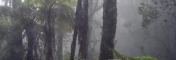
Fire is a natural part of all ecosystems. Wildfires have been burning vegetation and shaping landscapes far longer than people have been on Earth. However, changes in fire frequency and timing can result in degradation if the vegetation is not adapted to the new fire regimes. This can cause long-term damage to land biomass components affecting soil structure, nutrients and water cycling. This layer displays the areas of concern for fires related issues derived from the convergence of global evidence of human-environment interactions that can have consequences on land degradation.
The Fire Information for Resource Management System (FIRMS) of the National Aeronautics and Space Administration (NASA) uses satellite observations to detect active fires and thermal anomalies. They deliver this information to decision makers in near real-time (within 3 hours of satellite observation). This dataset includes active fires of the last 24h. Each point represents the centre of a 375 m resolution pixel where a fire was detected. It is updated twice daily. Compared to other coarser resolution (≥1km) satellite fire detection products, it provides improved response for smaller fires, improved mapping of large fire perimeters, and better detection at night, when fire activities usually occur. Consequently, the data are well suited for use in support of fire tracking and management (e.g., near real-time alert systems), as well as other science applications requiring improved fire mapping fidelity.
The Fire Information for Resource Management System (FIRMS) of the National Aeronautics and Space Administration (NASA) uses satellite observations to detect active fires and thermal anomalies. They deliver this information to decision makers in near real-time (within 3 hours of satellite observation). This dataset includes active fires of the last 48h. Each point represents the centre of a 375 m resolution pixel where a fire was detected. It is updated twice daily. Compared to other coarser resolution (≥1km) satellite fire detection products, it provides improved response for smaller fires, improved mapping of large fire perimeters, and better detection at night, when fire activities usually occur. Consequently, the data are well suited for use in support of fire tracking and management (e.g., near real-time alert systems), as well as other science applications requiring improved fire mapping fidelity.
The Fire Information for Resource Management System (FIRMS) of the National Aeronautics and Space Administration (NASA) uses satellite observations to detect active fires and thermal anomalies. They deliver this information to decision makers in near real-time (within 3 hours of satellite observation). This dataset includes active fires of the last 72h. Each point represents the centre of a 375 m resolution pixel where a fire was detected. It is updated twice daily. Compared to other coarser resolution (≥1km) satellite fire detection products, it provides improved response for smaller fires, improved mapping of large fire perimeters, and better detection at night, when fire activities usually occur. Consequently, the data are well suited for use in support of fire tracking and management (e.g., near real-time alert systems), as well as other science applications requiring improved fire mapping fidelity.

This dataset provides fixed broadband performance metrics in zoom level 16 web Mercator tiles (approximately 610.8 meters by 610.8 meters at the equator). Download speed is collected via the Speedtest by Ookla applications for Android and iOS and averaged for each tile. Measurements are filtered to results containing GPS-quality location accuracy. Speedtest data is used today by commercial fixed network operators around the world to inform network buildout, improve global Internet quality, and increase Internet accessibility. This data can be used for rural and urban connectivity development, to help make the internet better, faster, and more accessible for everyone.
This dataset provides fixed broadband performance metrics in zoom level 16 web Mercator tiles (approximately 610.8 meters by 610.8 meters at the equator). Download speed is collected via the Speedtest by Ookla applications for Android and iOS and averaged for each tile. Measurements are filtered to results containing GPS-quality location accuracy. Speedtest data is used today by commercial fixed network operators around the world to inform network buildout, improve global Internet quality, and increase Internet accessibility. This data can be used for rural and urban connectivity development, to help make the internet better, faster, and more accessible for everyone.
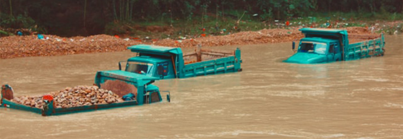
River floods are recognized as one of the major causes of economic damages and loss of human lives worldwide. Quantifying flood hazard is an essential component of resilience planning, prevention measures, emergency response, and mitigation, including insurance. This map depicts flood prone areas for flood events with a 100-year return period (i.e. with 1% chance of being exceeded in any one year). Cell values indicate water depth in meters. The map can be used to assess flood exposure and risk for population and assets.
Forest canopy height measures the average height of the tree canopy in 2012. This dataset is created by integrating broadscale optical remotely sensed data at 30-metre spatial resolution with on-the-ground measurements.
The Fraction of Photosynthetically Active Radiation Absorbed (FAPAR) is used to track the overall primary productivity associated with atmospheric CO2 fixation. FAPAR anomalies relative to the average between 2003 and 2010 show large surface variations, in terms of values and coverage, of vegetation productivity conditions over Africa. Temperature and precipitation deficits are the main drivers for the negative anomalies. Each location with a negative anomaly (FAPAR value lower than the long-term mean for that location – shades of red) indicates relative vegetation stress during that 10-day interval. Each location with a positive anomaly (FAPAR value higher than long-term mean for that location – shades of green) indicates relative favourable vegetation growth conditions during that 10-day interval. FAPAR values and their anomalies provide useful information for water and agricultural management purposes.
This layer is part of the Earth Land Information System (ELIS).
The Fraction of Absorbed Photosynthetically Active Radiation (FAPAR) is an Essential Climate Variable that serves as an integrated indicator of the status and health of plant canopies. FAPAR plays a critical role in the global carbon cycle and in determining primary productivity of the biosphere. Climate change affects the terrestrial ecosystem dynamics, but few of these dynamics are observable from space. FAPAR is monitored using space remote sensing techniques, allowing high resolution and near-real-time measures of the state and evolution of terrestrial vegetation dynamics.
This layer is part of the Earth Land Information System (ELIS).
Food crisis response planning can save lives if put in place in a timely manner. To do this, decision makers must be warned of climate extreme events impacting agricultural production. The Anomaly hotSpot of Agricultural Production tool (ASAP) is an online decision support system for early warning about hotspots of agricultural production anomaly (crop and rangeland), developed by the JRC for food security crises prevention and response planning anticipation. This map shows the frequency at which countries were classified as hotspots for agricultural production problems between 2004 and 2018. Hotspots are identified on a monthly basis.
Food crisis response planning can save lives if put in place in a timely manner. To do this, decision makers must be warned of climate extreme events impacting agricultural production. The Anomaly hotSpot of Agricultural Production tool (ASAP) is an online decision support system for early warning about hotspots of agricultural production anomaly (crop and rangeland), developed by the JRC for food security crises prevention and response planning anticipation. This map shows the frequency of ASAP anomaly warnings for crop growth for 2004-2018. It highlights the high sensitivity of the main agricultural areas in Northern Africa, the Horn of Africa and the Southern African Development Community to drought conditions.
Food crisis response planning can save lives if put in place in a timely manner. To do this, decision makers must be warned of climate extreme events impacting agricultural production. The Anomaly hotSpot of Agricultural Production tool (ASAP) is an online decision support system for early warning about hotspots of agricultural production anomaly (crop and rangeland), developed by the JRC for food security crises prevention and response planning anticipation. This map shows the frequency of ASAP anomaly warnings for rangeland growth for 2004-2018. It highlights the high sensitivity of the main agricultural areas in Northern Africa, the Horn of Africa and the Southern African Development Community to drought conditions.

Mapping ongoing project activities in the field of conservation in protected areas is essential to identify the various actors and to identify the areas where information and actors are scarce. The aim is to better understand who is funding what and where, with a view to improve decision-making on biodiversity conservation. This map provides the geolocation of all sites that have received funding in the frame of a biodiversity conservation project -or an activity within a project- within approx. the last 20 years. It specifies whether the site is protected or not. One project usually includes several sites.
This dataset maps regions across Africa with high geothermal energy exploration potential, identifying areas where further research and investment are most likely to yield significant returns. The mapping represents a synthesis of the Indicator Analysis performed by TNO (Hofstra, 2023), specifically selecting the most and least favorable technical outcomes under the assumption of a clay-poor sandstone (CP) compaction model.
To ensure structural robustness and account for geological uncertainty, the indicator results have been projected onto four distinct geological basin models:
Key Indicators & Methodology
The favorable results displayed in these maps are derived from a multi-criteria evaluation which includes:
This layer is part of the Geothermal Atlas for Africa developed within the LEAP-RE project.
This dataset maps the critical structural and tectonic features across Africa that serve as key indicators for geothermal resource potential. These layers delineate "fault/fracture zones" which are considered a primary geothermal resource play type for both magmatic and non-magmatic settings.
The layers in the dataset are:
These fault layers are crucial for characterizing subsurface hydraulic properties. Specifically, the dataset's features are utilized to:
This layer maps the distribution of diverse geothermal play types categorized by:
Location: Precise spatial boundaries of geothermal provinces.
Geodynamic Setting: Classification by tectonic regime.
Play Type: Categorization based on heat source and fluid transport mechanisms.
Energy Application: Indication of suitability for power production or direct-use applications.
This dataset provides the P50 projections for a geothermal system utilizing a Chiller unit.
Chiller refers to an absorption chiller or heat pump integrated into the geothermal system. It is used to provide cooling (by utilizing the geothermal heat) or to extract additional heat from the return fluid, thereby increasing the system's overall thermal harvest.
P50 is a statistical term used in risk analysis and forecasting. P50 represents the median scenario, meaning there is a 50% probability that the actual outcome will be higher than this value and a 50% probability it will be lower. It serves as the baseline "best estimate."
Metrics DefinitionsCoefficient of Performance (COP) [-]: A measure of efficiency, defined as the ratio of useful heating or cooling provided to the work (energy) required to operate the Chiller. Higher values indicate greater efficiency.
Doublet Net Production [MW]: The actual useful power output (Megawatts) generated by the "doublet" (one production well + one injection well), subtracting any energy used by pumps or auxiliary equipment.
Levelized Cost of Energy (LCOE) [US$ct/kWh]: The average revenue per unit of energy needed to recover the cost of building and operating the plant over its entire life cycle. It essentially represents the break-even price.
Net Present Value (NPV) [million US$]: The current financial value of all future cash flows the project will generate, minus the initial investment costs. A positive NPV generally indicates a profitable project.
Optimized Depth of the Aquifer [m]: The calculated ideal drilling depth (meters) to reach the geothermal reservoir that balances drilling costs with temperature/flow benefits.
Production Flow Rate [m³/h]: The volume of geothermal fluid extracted from the reservoir per hour (cubic meters per hour).
Temperature at Reservoir [°C]: The natural temperature (Celsius) of the geothermal fluid within the subsurface rock formation before it is brought to the surface.
Transmissivity [Dm]: A measure of how easily fluid flows through the porous aquifer. It is the product of hydraulic conductivity and aquifer thickness (often measured in Darcy-meters). High transmissivity means easier extraction.
Well Distance [m]: The physical distance (meters) between the production well (extraction) and the injection well (return). Proper spacing prevents "short-circuiting," where cool injected water lowers the temperature of the production well too quickly.
This dataset provides the P50 projections for a Direct Heat geothermal system.
Direct Heat refers to the use of geothermal energy for applications such as space heating, industrial processes, or agriculture. In the utilized model, it is assumed a minimum production temperature of at least 60°C and a reinjection temperature of 40°C.
P50 is a statistical term used in risk analysis and forecasting. P50 represents the median scenario, meaning there is a 50% probability that the actual outcome will be higher than this value and a 50% probability it will be lower. It serves as the baseline "best estimate."
Metrics DefinitionsCoefficient of Performance (COP) [-]: A measure of efficiency, defined as the ratio of useful heating or cooling provided to the work (energy) required to operate the Chiller. Higher values indicate greater efficiency.
Doublet Net Production [MW]: The actual useful power output (Megawatts) generated by the ""doublet"" (one production well + one injection well), subtracting any energy used by pumps or auxiliary equipment.
Levelized Cost of Energy (LCOE) [US$ct/kWh]: The average revenue per unit of energy needed to recover the cost of building and operating the plant over its entire life cycle. It essentially represents the break-even price.
Net Present Value (NPV) [million US$]: The current financial value of all future cash flows the project will generate, minus the initial investment costs. A positive NPV generally indicates a profitable project.
Optimized Depth of the Aquifer [m]: The calculated ideal drilling depth (meters) to reach the geothermal reservoir that balances drilling costs with temperature/flow benefits.
Production Flow Rate [m³/h]: The volume of geothermal fluid extracted from the reservoir per hour (cubic meters per hour).
Temperature at Reservoir [°C]: The natural temperature (Celsius) of the geothermal fluid within the subsurface rock formation before it is brought to the surface.
Transmissivity [Dm]: A measure of how easily fluid flows through the porous aquifer. It is the product of hydraulic conductivity and aquifer thickness (often measured in Darcy-meters). High transmissivity means easier extraction.
Well Distance [m]: The physical distance (meters) between the production well (extraction) and the injection well (return). Proper spacing prevents ""short-circuiting,"" where cool injected water lowers the temperature of the production well too quickly.
This dataset provides the P50 projections for a Direct Heat with Heat Pump geothermal system.
Direct Heat with Heat Pump refers to a scenario where a geothermal system is integrated with an industrial heat pump to upgrade low-grade heat. This allows for production from geothermal temperatures as low as 40°C, which are then heated by the pump to a delivery temperature of 80°C. The reinjection temperature is set to the production temperature minus 20°C, with a absolute minimum of 15°C.
P50 is a statistical term used in risk analysis and forecasting. P50 represents the median scenario, meaning there is a 50% probability that the actual outcome will be higher than this value and a 50% probability it will be lower. It serves as the baseline ""best estimate.""
Metrics DefinitionsCoefficient of Performance (COP) [-]: A measure of efficiency, defined as the ratio of useful heating or cooling provided to the work (energy) required to operate the Chiller. Higher values indicate greater efficiency.
Doublet Net Production [MW]: The actual useful power output (Megawatts) generated by the ""doublet"" (one production well + one injection well), subtracting any energy used by pumps or auxiliary equipment.
Levelized Cost of Energy (LCOE) [US$ct/kWh]: The average revenue per unit of energy needed to recover the cost of building and operating the plant over its entire life cycle. It essentially represents the break-even price.
Net Present Value (NPV) [million US$]: The current financial value of all future cash flows the project will generate, minus the initial investment costs. A positive NPV generally indicates a profitable project.
Optimized Depth of the Aquifer [m]: The calculated ideal drilling depth (meters) to reach the geothermal reservoir that balances drilling costs with temperature/flow benefits.
Production Flow Rate [m³/h]: The volume of geothermal fluid extracted from the reservoir per hour (cubic meters per hour).
Temperature at Reservoir [°C]: The natural temperature (Celsius) of the geothermal fluid within the subsurface rock formation before it is brought to the surface.
Transmissivity [Dm]: A measure of how easily fluid flows through the porous aquifer. It is the product of hydraulic conductivity and aquifer thickness (often measured in Darcy-meters). High transmissivity means easier extraction.
Well Distance [m]: The physical distance (meters) between the production well (extraction) and the injection well (return). Proper spacing prevents ""short-circuiting,"" where cool injected water lowers the temperature of the production well too quickly.
This dataset provides the P50 projections for an Organic Rankine Cycle (ORC) geothermal power plant.
Organic Rankine Cycle (ORC) refers to a binary power plant configuration where geothermal fluid (brine) is used to heat a secondary organic working fluid. This process allows for efficient electricity generation from medium-to-low temperature resources (typically 90°C to 150°C). The organic fluid vaporizes, drives a turbine, and is then condensed back into a liquid to repeat the cycle. The geothermal brine is reinjected into the reservoir after passing through the heat exchanger.
P50 is a statistical term used in risk analysis and forecasting. P50 represents the median scenario, meaning there is a 50% probability that the actual outcome will be higher than this value and a 50% probability it will be lower. It serves as the baseline ""best estimate.""
Metrics DefinitionsCoefficient of Performance (COP) [-]: A measure of efficiency, defined as the ratio of useful heating or cooling provided to the work (energy) required to operate the Chiller. Higher values indicate greater efficiency.
Doublet Net Production [MW]: The actual useful power output (Megawatts) generated by the ""doublet"" (one production well + one injection well), subtracting any energy used by pumps or auxiliary equipment.
Levelized Cost of Energy (LCOE) [US$ct/kWh]: The average revenue per unit of energy needed to recover the cost of building and operating the plant over its entire life cycle. It essentially represents the break-even price.
Net Present Value (NPV) [million US$]: The current financial value of all future cash flows the project will generate, minus the initial investment costs. A positive NPV generally indicates a profitable project.
Optimized Depth of the Aquifer [m]: The calculated ideal drilling depth (meters) to reach the geothermal reservoir that balances drilling costs with temperature/flow benefits.
Production Flow Rate [m³/h]: The volume of geothermal fluid extracted from the reservoir per hour (cubic meters per hour).
Temperature at Reservoir [°C]: The natural temperature (Celsius) of the geothermal fluid within the subsurface rock formation before it is brought to the surface.
Transmissivity [Dm]: A measure of how easily fluid flows through the porous aquifer. It is the product of hydraulic conductivity and aquifer thickness (often measured in Darcy-meters). High transmissivity means easier extraction.
Well Distance [m]: The physical distance (meters) between the production well (extraction) and the injection well (return). Proper spacing prevents ""short-circuiting,"" where cool injected water lowers the temperature of the production well too quickly.
Based on the Geothermal Atlas for Africa , the temperature models at 1 km, 2 km, 3 km, and 4 km depth are part of a 3D conductive thermal model of the African lithosphere.
These layers can be described as follows:
This dataset comprises a collection of shapefiles detailing the geographical locations and attributes of various wells across Africa, with a strong focus on geothermal exploration and assessment. Together, these layers offer a valuable resource for geothermal energy planning, subsurface geological analysis, and infrastructure mapping. The collection includes the following spatial data layers:
These layers are part of the Geothermal Atlas for Africa developed within the LEAP-RE project"
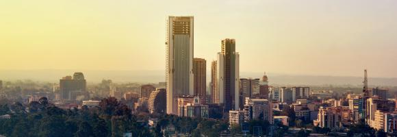
This raster dataset depicts the distribution of the building heights, as Average of the Net Building Height (ANBH), generalized at the resolution of 100m, and referred to the year 2018. The input data used to predict the building heights are the ALOS Global Digital Surface Model "ALOS World 3D - 30m (AW3D30)25, the NASA Shuttle Radar Topographic Mission data - 30m (SRTM30)26 , and the Sentinel-2 global pixel based image composite from L1C data for the period 2017-201827 that is the support of the year 2018 in this release.
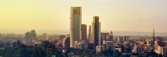
GHS-BUILT-S R2023A - GHS built-up surface grid, derived from Sentinel2 composite and Landsat, multitemporal (1975-2030). The spatial raster dataset depicts the distribution of built-up surfaces, expressed as the number of square meters. The data report about the total built-up surface and the built-up surface allocated to dominant non-residential (NRES) uses.
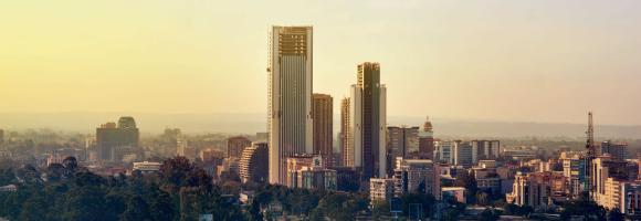
The GHS-BUILT-S spatial raster dataset depicts the distribution of the built-up (BU) surfaces estimates between 1975 and 2030 in 5 year intervals and two functional use components a) the total BU surface and b) the non-residential (NRES) BU surface. The data is made by spatial-temporal interpolation of five observed collections of multiple-sensor, multiple-platform satellite imageries: Landsat (MSS, TM, ETM sensor) data supports the 1975, 1990, 2000, and 2014 epochs, while a Sentinel-2 (S2) image composite (GHS-composite-S2 R2020A) supports the 2018 epoch.
This data represents the total BU surface (square meters) for year 1975 over cells of 1x1 km size.
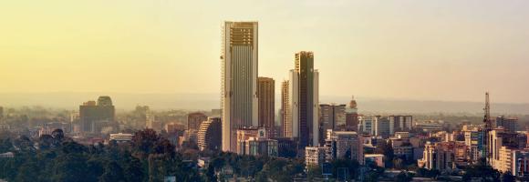
The GHS-BUILT-S spatial raster dataset depicts the distribution of the built-up (BU) surfaces estimates between 1975 and 2030 in 5 year intervals and two functional use components a) the total BU surface and b) the non-residential (NRES) BU surface. The data is made by spatial-temporal interpolation of five observed collections of multiple-sensor, multiple-platform satellite imageries: Landsat (MSS, TM, ETM sensor) data supports the 1975, 1990, 2000, and 2014 epochs, while a Sentinel-2 (S2) image composite (GHS-composite-S2 R2020A) supports the 2018 epoch.
This data represents the total BU surface estimates (square meters) for year 1975 over cells of 100x100 m size.
The GHS-BUILT-S spatial raster dataset depicts the distribution of the built-up (BU) surfaces estimates between 1975 and 2030 in 5 year intervals and two functional use components a) the total BU surface and b) the non-residential (NRES) BU surface. The data is made by spatial-temporal interpolation of five observed collections of multiple-sensor, multiple-platform satellite imageries: Landsat (MSS, TM, ETM sensor) data supports the 1975, 1990, 2000, and 2014 epochs, while a Sentinel-2 (S2) image composite (GHS-composite-S2 R2020A) supports the 2018 epoch.
This data represents the total BU surface (square meters) for year 1980 over cells of 1x1 km size.
The GHS-BUILT-S spatial raster dataset depicts the distribution of the built-up (BU) surfaces estimates between 1975 and 2030 in 5 year intervals and two functional use components a) the total BU surface and b) the non-residential (NRES) BU surface. The data is made by spatial-temporal interpolation of five observed collections of multiple-sensor, multiple-platform satellite imageries: Landsat (MSS, TM, ETM sensor) data supports the 1975, 1990, 2000, and 2014 epochs, while a Sentinel-2 (S2) image composite (GHS-composite-S2 R2020A) supports the 2018 epoch.
This data represents the total BU surface estimates (square meters) for year 1980 over cells of 100x100 m size.
The GHS-BUILT-S spatial raster dataset depicts the distribution of the built-up (BU) surfaces estimates between 1975 and 2030 in 5 year intervals and two functional use components a) the total BU surface and b) the non-residential (NRES) BU surface. The data is made by spatial-temporal interpolation of five observed collections of multiple-sensor, multiple-platform satellite imageries: Landsat (MSS, TM, ETM sensor) data supports the 1975, 1990, 2000, and 2014 epochs, while a Sentinel-2 (S2) image composite (GHS-composite-S2 R2020A) supports the 2018 epoch.
This data represents the total BU surface (square meters) for year 1985 over cells of 1x1 km size.
The GHS-BUILT-S spatial raster dataset depicts the distribution of the built-up (BU) surfaces estimates between 1975 and 2030 in 5 year intervals and two functional use components a) the total BU surface and b) the non-residential (NRES) BU surface. The data is made by spatial-temporal interpolation of five observed collections of multiple-sensor, multiple-platform satellite imageries: Landsat (MSS, TM, ETM sensor) data supports the 1975, 1990, 2000, and 2014 epochs, while a Sentinel-2 (S2) image composite (GHS-composite-S2 R2020A) supports the 2018 epoch.
This data represents the total BU surface estimates (square meters) for year 1985 over cells of 100x100 m size.
The GHS-BUILT-S spatial raster dataset depicts the distribution of the built-up (BU) surfaces estimates between 1975 and 2030 in 5 year intervals and two functional use components a) the total BU surface and b) the non-residential (NRES) BU surface. The data is made by spatial-temporal interpolation of five observed collections of multiple-sensor, multiple-platform satellite imageries: Landsat (MSS, TM, ETM sensor) data supports the 1975, 1990, 2000, and 2014 epochs, while a Sentinel-2 (S2) image composite (GHS-composite-S2 R2020A) supports the 2018 epoch.
This data represents the total BU surface (square meters) for year 1990 over cells of 1x1 km size.
The GHS-BUILT-S spatial raster dataset depicts the distribution of the built-up (BU) surfaces estimates between 1975 and 2030 in 5 year intervals and two functional use components a) the total BU surface and b) the non-residential (NRES) BU surface. The data is made by spatial-temporal interpolation of five observed collections of multiple-sensor, multiple-platform satellite imageries: Landsat (MSS, TM, ETM sensor) data supports the 1975, 1990, 2000, and 2014 epochs, while a Sentinel-2 (S2) image composite (GHS-composite-S2 R2020A) supports the 2018 epoch.
This data represents the total BU surface estimates (square meters) for year 1990 over cells of 100x100 m size.
The GHS-BUILT-S spatial raster dataset depicts the distribution of the built-up (BU) surfaces estimates between 1975 and 2030 in 5 year intervals and two functional use components a) the total BU surface and b) the non-residential (NRES) BU surface. The data is made by spatial-temporal interpolation of five observed collections of multiple-sensor, multiple-platform satellite imageries: Landsat (MSS, TM, ETM sensor) data supports the 1975, 1990, 2000, and 2014 epochs, while a Sentinel-2 (S2) image composite (GHS-composite-S2 R2020A) supports the 2018 epoch.
This data represents the total BU surface (square meters) for year 1995 over cells of 1x1 km size.
The GHS-BUILT-S spatial raster dataset depicts the distribution of the built-up (BU) surfaces estimates between 1975 and 2030 in 5 year intervals and two functional use components a) the total BU surface and b) the non-residential (NRES) BU surface. The data is made by spatial-temporal interpolation of five observed collections of multiple-sensor, multiple-platform satellite imageries: Landsat (MSS, TM, ETM sensor) data supports the 1975, 1990, 2000, and 2014 epochs, while a Sentinel-2 (S2) image composite (GHS-composite-S2 R2020A) supports the 2018 epoch.
This data represents the total BU surface estimates (square meters) for year 1995 over cells of 100x100 m size.
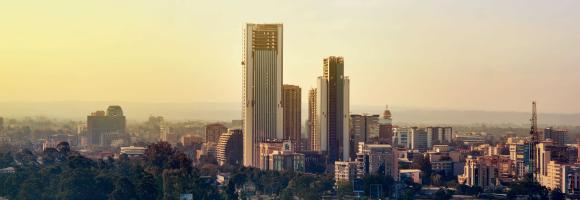
The GHS-BUILT-S spatial raster dataset depicts the distribution of the built-up (BU) surfaces estimates between 1975 and 2030 in 5 year intervals and two functional use components a) the total BU surface and b) the non-residential (NRES) BU surface. The data is made by spatial-temporal interpolation of five observed collections of multiple-sensor, multiple-platform satellite imageries: Landsat (MSS, TM, ETM sensor) data supports the 1975, 1990, 2000, and 2014 epochs, while a Sentinel-2 (S2) image composite (GHS-composite-S2 R2020A) supports the 2018 epoch.
This data represents the total BU surface (square meters) for year 2000 over cells of 1x1 km size.
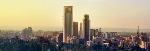
The GHS-BUILT-S spatial raster dataset depicts the distribution of the built-up (BU) surfaces estimates between 1975 and 2030 in 5 year intervals and two functional use components a) the total BU surface and b) the non-residential (NRES) BU surface. The data is made by spatial-temporal interpolation of five observed collections of multiple-sensor, multiple-platform satellite imageries: Landsat (MSS, TM, ETM sensor) data supports the 1975, 1990, 2000, and 2014 epochs, while a Sentinel-2 (S2) image composite (GHS-composite-S2 R2020A) supports the 2018 epoch.
This data represents the total BU surface estimates (square meters) for year 2000 over cells of 100x100 m size.
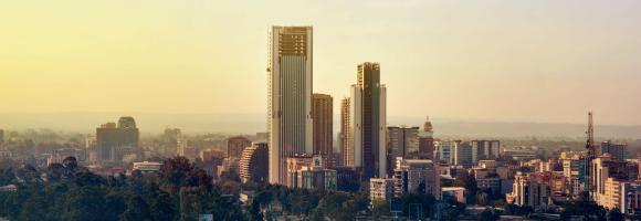
The GHS-BUILT-S spatial raster dataset depicts the distribution of the built-up (BU) surfaces estimates between 1975 and 2030 in 5 year intervals and two functional use components a) the total BU surface and b) the non-residential (NRES) BU surface. The data is made by spatial-temporal interpolation of five observed collections of multiple-sensor, multiple-platform satellite imageries: Landsat (MSS, TM, ETM sensor) data supports the 1975, 1990, 2000, and 2014 epochs, while a Sentinel-2 (S2) image composite (GHS-composite-S2 R2020A) supports the 2018 epoch.
This data represents the total BU surface (square meters) for year 2005 over cells of 1x1 km size.
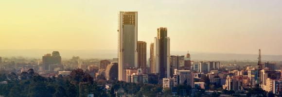
The GHS-BUILT-S spatial raster dataset depicts the distribution of the built-up (BU) surfaces estimates between 1975 and 2030 in 5 year intervals and two functional use components a) the total BU surface and b) the non-residential (NRES) BU surface. The data is made by spatial-temporal interpolation of five observed collections of multiple-sensor, multiple-platform satellite imageries: Landsat (MSS, TM, ETM sensor) data supports the 1975, 1990, 2000, and 2014 epochs, while a Sentinel-2 (S2) image composite (GHS-composite-S2 R2020A) supports the 2018 epoch.
This data represents the total BU surface estimates (square meters) for year 2005 over cells of 100x100 m size.
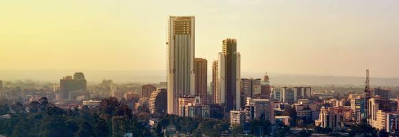
The GHS-BUILT-S spatial raster dataset depicts the distribution of the built-up (BU) surfaces estimates between 1975 and 2030 in 5 year intervals and two functional use components a) the total BU surface and b) the non-residential (NRES) BU surface. The data is made by spatial-temporal interpolation of five observed collections of multiple-sensor, multiple-platform satellite imageries: Landsat (MSS, TM, ETM sensor) data supports the 1975, 1990, 2000, and 2014 epochs, while a Sentinel-2 (S2) image composite (GHS-composite-S2 R2020A) supports the 2018 epoch.
This data represents the total BU surface (square meters) for year 2010 over cells of 1x1 km size.
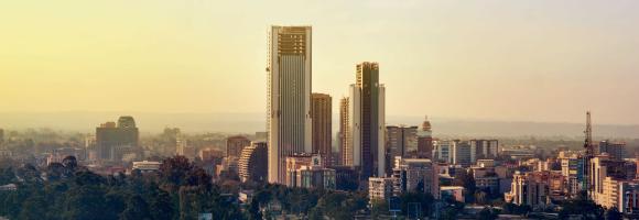
The GHS-BUILT-S spatial raster dataset depicts the distribution of the built-up (BU) surfaces estimates between 1975 and 2030 in 5 year intervals and two functional use components a) the total BU surface and b) the non-residential (NRES) BU surface. The data is made by spatial-temporal interpolation of five observed collections of multiple-sensor, multiple-platform satellite imageries: Landsat (MSS, TM, ETM sensor) data supports the 1975, 1990, 2000, and 2014 epochs, while a Sentinel-2 (S2) image composite (GHS-composite-S2 R2020A) supports the 2018 epoch.
This data represents the total BU surface estimates (square meters) for year 2010 over cells of 100x100 m size.
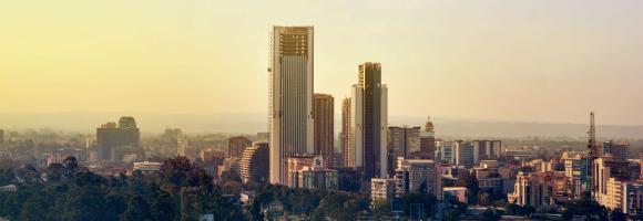
The GHS-BUILT-S spatial raster dataset depicts the distribution of the built-up (BU) surfaces estimates between 1975 and 2030 in 5 year intervals and two functional use components a) the total BU surface and b) the non-residential (NRES) BU surface. The data is made by spatial-temporal interpolation of five observed collections of multiple-sensor, multiple-platform satellite imageries: Landsat (MSS, TM, ETM sensor) data supports the 1975, 1990, 2000, and 2014 epochs, while a Sentinel-2 (S2) image composite (GHS-composite-S2 R2020A) supports the 2018 epoch.
This data represents the total BU surface (square meters) for year 2015 over cells of 1x1 km size.
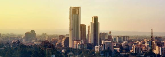
The GHS-BUILT-S spatial raster dataset depicts the distribution of the built-up (BU) surfaces estimates between 1975 and 2030 in 5 year intervals and two functional use components a) the total BU surface and b) the non-residential (NRES) BU surface. The data is made by spatial-temporal interpolation of five observed collections of multiple-sensor, multiple-platform satellite imageries: Landsat (MSS, TM, ETM sensor) data supports the 1975, 1990, 2000, and 2014 epochs, while a Sentinel-2 (S2) image composite (GHS-composite-S2 R2020A) supports the 2018 epoch.
This data represents the total BU surface estimates (square meters) for year 2015 over cells of 100x100 m size.
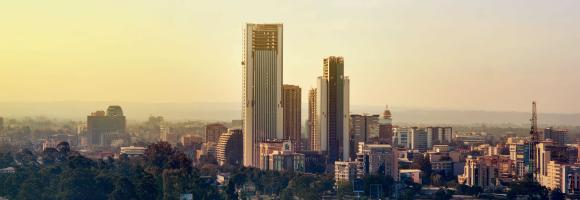
The GHS-BUILT-S spatial raster dataset depicts the distribution of the built-up (BU) surfaces estimates between 1975 and 2030 in 5 year intervals and two functional use components a) the total BU surface and b) the non-residential (NRES) BU surface. The data is made by spatial-temporal interpolation of five observed collections of multiple-sensor, multiple-platform satellite imageries: Landsat (MSS, TM, ETM sensor) data supports the 1975, 1990, 2000, and 2014 epochs, while a Sentinel-2 (S2) image composite (GHS-composite-S2 R2020A) supports the 2018 epoch.
This data represents the total BU surface (square meters) for year 2020 over cells of 1x1 km size.
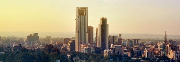
The GHS-BUILT-S spatial raster dataset depicts the distribution of the built-up (BU) surfaces estimates between 1975 and 2030 in 5 year intervals and two functional use components a) the total BU surface and b) the non-residential (NRES) BU surface. The data is made by spatial-temporal interpolation of five observed collections of multiple-sensor, multiple-platform satellite imageries: Landsat (MSS, TM, ETM sensor) data supports the 1975, 1990, 2000, and 2014 epochs, while a Sentinel-2 (S2) image composite (GHS-composite-S2 R2020A) supports the 2018 epoch.
This data represents the total BU surface estimates (square meters) for year 2020 over cells of 100x100 m size.
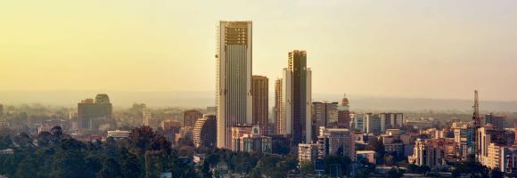
The GHS-BUILT-S spatial raster dataset depicts the distribution of the built-up (BU) surfaces estimates between 1975 and 2030 in 5 year intervals and two functional use components a) the total BU surface and b) the non-residential (NRES) BU surface. The data is made by spatial-temporal interpolation of five observed collections of multiple-sensor, multiple-platform satellite imageries: Landsat (MSS, TM, ETM sensor) data supports the 1975, 1990, 2000, and 2014 epochs, while a Sentinel-2 (S2) image composite (GHS-composite-S2 R2020A) supports the 2018 epoch.
This data represents the total BU surface estimates (square meters) for year 2025 over cells of 1x1 km size.
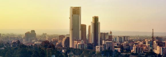
The GHS-BUILT-S spatial raster dataset depicts the distribution of the built-up (BU) surfaces estimates between 1975 and 2030 in 5 year intervals and two functional use components a) the total BU surface and b) the non-residential (NRES) BU surface. The data is made by spatial-temporal interpolation of five observed collections of multiple-sensor, multiple-platform satellite imageries: Landsat (MSS, TM, ETM sensor) data supports the 1975, 1990, 2000, and 2014 epochs, while a Sentinel-2 (S2) image composite (GHS-composite-S2 R2020A) supports the 2018 epoch.
This data represents the total BU surface estimates (square meters) for year 2025 over cells of 100x100 m size.
The GHS-BUILT-S spatial raster dataset depicts the distribution of the built-up (BU) surfaces estimates between 1975 and 2030 in 5 year intervals and two functional use components a) the total BU surface and b) the non-residential (NRES) BU surface. The data is made by spatial-temporal interpolation of five observed collections of multiple-sensor, multiple-platform satellite imageries: Landsat (MSS, TM, ETM sensor) data supports the 1975, 1990, 2000, and 2014 epochs, while a Sentinel-2 (S2) image composite (GHS-composite-S2 R2020A) supports the 2018 epoch.
This data represents the total BU surface estimates (square meters) for year 2030 over cells of 1x1 km size.
The GHS-BUILT-S spatial raster dataset depicts the distribution of the built-up (BU) surfaces estimates between 1975 and 2030 in 5 year intervals and two functional use components a) the total BU surface and b) the non-residential (NRES) BU surface. The data is made by spatial-temporal interpolation of five observed collections of multiple-sensor, multiple-platform satellite imageries: Landsat (MSS, TM, ETM sensor) data supports the 1975, 1990, 2000, and 2014 epochs, while a Sentinel-2 (S2) image composite (GHS-composite-S2 R2020A) supports the 2018 epoch.
This data represents the total BU surface estimates (square meters) for year 2030 over cells of 1x1 km size.
The GHS-BUILT-S spatial raster dataset depicts the distribution of the built-up (BU) surfaces estimates between 1975 and 2030 in 5 year intervals and two functional use components a) the total BU surface and b) the non-residential (NRES) BU surface. The data is made by spatial-temporal interpolation of five observed collections of multiple-sensor, multiple-platform satellite imageries: Landsat (MSS, TM, ETM sensor) data supports the 1975, 1990, 2000, and 2014 epochs, while a Sentinel-2 (S2) image composite (GHS-composite-S2 R2020A) supports the 2018 epoch.
This data represents the total BU surface estimates (square meters) for year 2030 over cells of 100x100 m size.
The GHS-BUILT-S spatial raster dataset depicts the distribution of the built-up (BU) surfaces estimates between 1975 and 2030 in 5 year intervals and two functional use components a) the total BU surface and b) the non-residential (NRES) BU surface. The data is made by spatial-temporal interpolation of five observed collections of multiple-sensor, multiple-platform satellite imageries: Landsat (MSS, TM, ETM sensor) data supports the 1975, 1990, 2000, and 2014 epochs, while a Sentinel-2 (S2) image composite (GHS-composite-S2 R2020A) supports the 2018 epoch.
This data represents the total BU surface estimates (square meters) for year 2030 over cells of 100x100 m size.
The GHS-BUILT-S spatial raster dataset depicts the distribution of the built-up (BU) surfaces estimates between 1975 and 2030 in 5 year intervals and two functional use components a) the total BU surface and b) the non-residential (NRES) BU surface. The data is made by spatial-temporal interpolation of five observed collections of multiple-sensor, multiple-platform satellite imageries: Landsat (MSS, TM, ETM sensor) data supports the 1975, 1990, 2000, and 2014 epochs, while a Sentinel-2 (S2) image composite (GHS-composite-S2 R2020A) supports the 2018 epoch.
This data represents the Non Residential BU surface estimates (square meters) for year 2030 over cells of 100 x100 m size.
The GHS-BUILT-S spatial raster dataset depicts the distribution of the built-up (BU) surfaces estimates between 1975 and 2030 in 5 year intervals and two functional use components a) the total BU surface and b) the non-residential (NRES) BU surface. The data is made by spatial-temporal interpolation of five observed collections of multiple-sensor, multiple-platform satellite imageries: Landsat (MSS, TM, ETM sensor) data supports the 1975, 1990, 2000, and 2014 epochs, while a Sentinel-2 (S2) image composite (GHS-composite-S2 R2020A) supports the 2018 epoch.
This data represents the Non residential BU surface estimates (square meters) for year 2030 over cells of 1x1 km size.
This data represents the total built-up volume between 1975 and 2030 in 5 year intervals over cells of 1x1 km size.
It derives from the GHS-BUILT-V - R2023A spatial raster dataset, that depicts the distribution of built-up volumes, expressed as number of cubic metres. The data report about the total built-up volume and the built-up volume allocated to dominant non-residential (NRES) uses.
The dataset is part the Global Human Settlement Layer , Global, high-resolution, multi-temporal gridded data on built-up environment (built-up surface, built-up volume, residential vs. non-residential function), resident population, and settlement classification by the UN-recommended methodology “degree of urbanisation”. The complete information about the GHSL main products can be found in the GHSL Data Package 2023 report
This data represents the total built-up volume between 1975 and 2030 in 5 year intervals over cells of 1x1 km size.
It derives from the GHS-BUILT-V - R2023A spatial raster dataset, that depicts the distribution of built-up volumes, expressed as number of cubic metres. The data report about the total built-up volume and the built-up volume allocated to dominant non-residential (NRES) uses.
The dataset is part the Global Human Settlement Layer , Global, high-resolution, multi-temporal gridded data on built-up environment (built-up surface, built-up volume, residential vs. non-residential function), resident population, and settlement classification by the UN-recommended methodology “degree of urbanisation”. The complete information about the GHSL main products can be found in the GHSL Data Package 2023 report
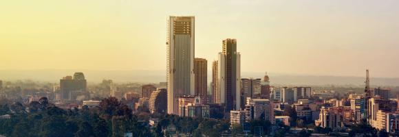
This data represents the total built-up volume between 1975 and 2030 in 5 year intervals over cells of 1x1 km size.
It derives from the GHS-BUILT-V - R2023A spatial raster dataset, that depicts the distribution of built-up volumes, expressed as number of cubic metres. The data report about the total built-up volume and the built-up volume allocated to dominant non-residential (NRES) uses.
The dataset is part the Global Human Settlement Layer , Global, high-resolution, multi-temporal gridded data on built-up environment (built-up surface, built-up volume, residential vs. non-residential function), resident population, and settlement classification by the UN-recommended methodology “degree of urbanisation”. The complete information about the GHSL main products can be found in the GHSL Data Package 2023 report
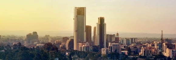
This data represents the total built-up volume between 1975 and 2030 in 5 year intervals over cells of 1x1 km size.
It derives from the GHS-BUILT-V - R2023A spatial raster dataset, that depicts the distribution of built-up volumes, expressed as number of cubic metres. The data report about the total built-up volume and the built-up volume allocated to dominant non-residential (NRES) uses.
The dataset is part the Global Human Settlement Layer , Global, high-resolution, multi-temporal gridded data on built-up environment (built-up surface, built-up volume, residential vs. non-residential function), resident population, and settlement classification by the UN-recommended methodology “degree of urbanisation”. The complete information about the GHSL main products can be found in the GHSL Data Package 2023 report
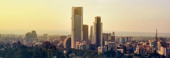
This data represents the total built-up volume between 1975 and 2030 in 5 year intervals over cells of 1x1 km size.
It derives from the GHS-BUILT-V - R2023A spatial raster dataset, that depicts the distribution of built-up volumes, expressed as number of cubic metres. The data report about the total built-up volume and the built-up volume allocated to dominant non-residential (NRES) uses.
The dataset is part the Global Human Settlement Layer , Global, high-resolution, multi-temporal gridded data on built-up environment (built-up surface, built-up volume, residential vs. non-residential function), resident population, and settlement classification by the UN-recommended methodology “degree of urbanisation”. The complete information about the GHSL main products can be found in the GHSL Data Package 2023 report
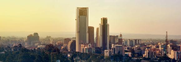
This data represents the total built-up volume between 1975 and 2030 in 5 year intervals over cells of 1x1 km size.
It derives from the GHS-BUILT-V - R2023A spatial raster dataset, that depicts the distribution of built-up volumes, expressed as number of cubic metres. The data report about the total built-up volume and the built-up volume allocated to dominant non-residential (NRES) uses.
The dataset is part the Global Human Settlement Layer , Global, high-resolution, multi-temporal gridded data on built-up environment (built-up surface, built-up volume, residential vs. non-residential function), resident population, and settlement classification by the UN-recommended methodology “degree of urbanisation”. The complete information about the GHSL main products can be found in the GHSL Data Package 2023 report
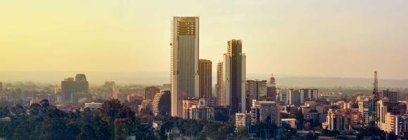
This data represents the total built-up volume between 1975 and 2030 in 5 year intervals over cells of 1x1 km size.
It derives from the GHS-BUILT-V - R2023A spatial raster dataset, that depicts the distribution of built-up volumes, expressed as number of cubic metres. The data report about the total built-up volume and the built-up volume allocated to dominant non-residential (NRES) uses.
The dataset is part the Global Human Settlement Layer , Global, high-resolution, multi-temporal gridded data on built-up environment (built-up surface, built-up volume, residential vs. non-residential function), resident population, and settlement classification by the UN-recommended methodology “degree of urbanisation”. The complete information about the GHSL main products can be found in the GHSL Data Package 2023 report
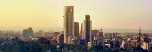
This data represents the total built-up volume between 1975 and 2030 in 5 year intervals over cells of 1x1 km size.
It derives from the GHS-BUILT-V - R2023A spatial raster dataset, that depicts the distribution of built-up volumes, expressed as number of cubic metres. The data report about the total built-up volume and the built-up volume allocated to dominant non-residential (NRES) uses.
The dataset is part the Global Human Settlement Layer , Global, high-resolution, multi-temporal gridded data on built-up environment (built-up surface, built-up volume, residential vs. non-residential function), resident population, and settlement classification by the UN-recommended methodology “degree of urbanisation”. The complete information about the GHSL main products can be found in the GHSL Data Package 2023 report
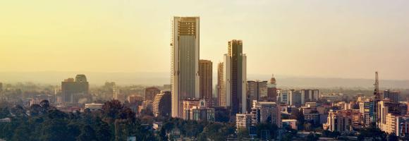
This data represents the total built-up volume between 1975 and 2030 in 5 year intervals over cells of 1x1 km size.
It derives from the GHS-BUILT-V - R2023A spatial raster dataset, that depicts the distribution of built-up volumes, expressed as number of cubic metres. The data report about the total built-up volume and the built-up volume allocated to dominant non-residential (NRES) uses.
The dataset is part the Global Human Settlement Layer , Global, high-resolution, multi-temporal gridded data on built-up environment (built-up surface, built-up volume, residential vs. non-residential function), resident population, and settlement classification by the UN-recommended methodology “degree of urbanisation”. The complete information about the GHSL main products can be found in the GHSL Data Package 2023 report
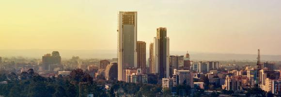
This data represents the total built-up volume between 1975 and 2030 in 5 year intervals over cells of 1x1 km size.
It derives from the GHS-BUILT-V - R2023A spatial raster dataset, that depicts the distribution of built-up volumes, expressed as number of cubic metres. The data report about the total built-up volume and the built-up volume allocated to dominant non-residential (NRES) uses.
The dataset is part the Global Human Settlement Layer , Global, high-resolution, multi-temporal gridded data on built-up environment (built-up surface, built-up volume, residential vs. non-residential function), resident population, and settlement classification by the UN-recommended methodology “degree of urbanisation”. The complete information about the GHSL main products can be found in the GHSL Data Package 2023 report
The GHS-BUILT-V R2023A dataset depicts the distribution of built-up volumes, expressed as number of cubic meters. This data reports about the total built-up volume. Data are spatial-temporal interpolated from 1975 to 2030 in 5 year intervals. Data were obtained by multiplying the GHS built-up surface versus the GHS building height (ANBH) part of the same GHS collection. The layer available within this portal depicts the 2030 prediction.
This data represents the total built-up volume between 1975 and 2030 in 5 year intervals over cells of 1x1 km size.
It derives from the GHS-BUILT-V - R2023A spatial raster dataset, that depicts the distribution of built-up volumes, expressed as number of cubic metres. The data report about the total built-up volume and the built-up volume allocated to dominant non-residential (NRES) uses.
The dataset is part the Global Human Settlement Layer , Global, high-resolution, multi-temporal gridded data on built-up environment (built-up surface, built-up volume, residential vs. non-residential function), resident population, and settlement classification by the UN-recommended methodology “degree of urbanisation”. The complete information about the GHSL main products can be found in the GHSL Data Package 2023 report
The GHS-BUILT-V R2023A dataset depicts the distribution of built-up volumes, expressed as number of cubic meters. This data reports about the total built-up volume. Data are spatial-temporal interpolated from 1975 to 2030 in 5 year intervals. Data were obtained by multiplying the GHS built-up surface versus the GHS building height (ANBH) part of the same GHS collection. The layer available within this portal depicts the 2030 prediction.
The GHS-BUILT-V R2023A dataset depicts the distribution of built-up volumes, expressed as number of cubic meters. The data reports about the built-up volume allocated to dominant non-residential (NRES) uses. Data are spatial-temporal interpolated from 1975 to 2030 in 5 year intervals. Data were obtained by multiplying the GHS built-up surface versus the GHS building height (ANBH) part of the same GHS collection. The layer available within this portal depicts the 2030 prediction.
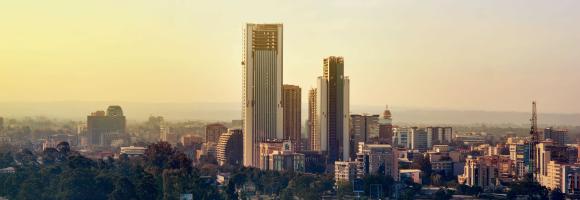
The GHS-BUILT-V R2023A dataset depicts the distribution of built-up volumes, expressed as number of cubic meters. The data reports about the built-up volume allocated to dominant non-residential (NRES) uses. Data are spatial-temporal interpolated from 1975 to 2030 in 5 year intervals. Data were obtained by multiplying the GHS built-up surface versus the GHS building height (ANBH) part of the same GHS collection. The layer available within this portal depicts the 2030 prediction.
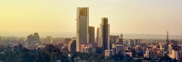
This data represents the distribution of human population between 1975 and 2030 in 5 year intervals over cells of 100x100 m size.
It derives from the GHS-POP - R2023A. Residential population estimates between 1975 and 2020 in 5-year intervals and projections to 2025 and 2030 derived from CIESIN GPWv4.11 were disaggregated from census or administrative units to grid cells, informed by the distribution, volume, and classification of built-up as mapped in the Global Human Settlement Layer (GHSL) global layer per corresponding epoch.
The dataset is part the Global Human Settlement Layer, that provide global, high-resolution, multi-temporal gridded data on built-up environment (built-up surface, built-up volume, residential vs. non-residential function), resident population, and settlement classification by the UN-recommended methodology “degree of urbanisation”. The complete information about the GHSL main products can be found in the GHSL Data Package 2023 report.
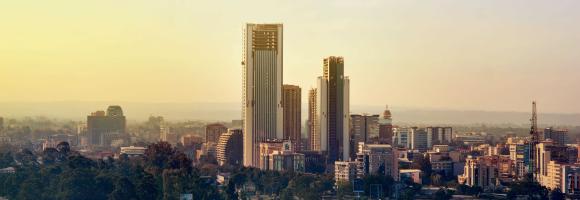
This data represents the distribution of human population between 1975 and 2030 in 5 year intervals over cells of 100x100 m size.
It derives from the GHS-POP - R2023A. Residential population estimates between 1975 and 2020 in 5-year intervals and projections to 2025 and 2030 derived from CIESIN GPWv4.11 were disaggregated from census or administrative units to grid cells, informed by the distribution, volume, and classification of built-up as mapped in the Global Human Settlement Layer (GHSL) global layer per corresponding epoch.
The dataset is part the Global Human Settlement Layer, that provide global, high-resolution, multi-temporal gridded data on built-up environment (built-up surface, built-up volume, residential vs. non-residential function), resident population, and settlement classification by the UN-recommended methodology “degree of urbanisation”. The complete information about the GHSL main products can be found in the GHSL Data Package 2023 report.
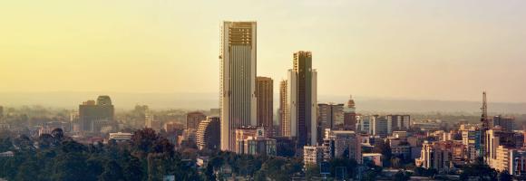
This data represents the distribution of human population between 1975 and 2030 in 5 year intervals over cells of 1x1 km size.
It derives from the GHS-POP - R2023A. Residential population estimates between 1975 and 2020 in 5-year intervals and projections to 2025 and 2030 derived from CIESIN GPWv4.11 were disaggregated from census or administrative units to grid cells, informed by the distribution, volume, and classification of built-up as mapped in the Global Human Settlement Layer (GHSL) global layer per corresponding epoch.
The dataset is part the Global Human Settlement Layer, that provide global, high-resolution, multi-temporal gridded data on built-up environment (built-up surface, built-up volume, residential vs. non-residential function), resident population, and settlement classification by the UN-recommended methodology “degree of urbanisation”. The complete information about the GHSL main products can be found in the GHSL Data Package 2023 report.
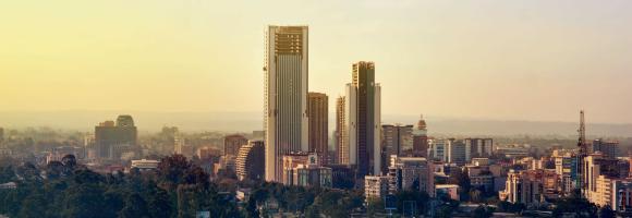
This data represents the distribution of human population between 1975 and 2030 in 5 year intervals over cells of 1x1 km size.
It derives from the GHS-POP - R2023A. Residential population estimates between 1975 and 2020 in 5-year intervals and projections to 2025 and 2030 derived from CIESIN GPWv4.11 were disaggregated from census or administrative units to grid cells, informed by the distribution, volume, and classification of built-up as mapped in the Global Human Settlement Layer (GHSL) global layer per corresponding epoch.
The dataset is part the Global Human Settlement Layer, that provide global, high-resolution, multi-temporal gridded data on built-up environment (built-up surface, built-up volume, residential vs. non-residential function), resident population, and settlement classification by the UN-recommended methodology “degree of urbanisation”. The complete information about the GHSL main products can be found in the GHSL Data Package 2023 report.
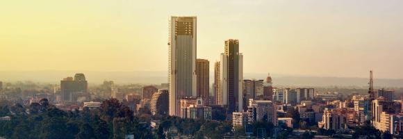
This data represents the total built-up volume between 1975 and 2030 in 5 year intervals over cells of 1x1 km size.
It derives from the GHS-BUILT-V - R2023A spatial raster dataset, that depicts the distribution of built-up volumes, expressed as number of cubic metres. The data report about the total built-up volume and the built-up volume allocated to dominant non-residential (NRES) uses.
The dataset is part the Global Human Settlement Layer , Global, high-resolution, multi-temporal gridded data on built-up environment (built-up surface, built-up volume, residential vs. non-residential function), resident population, and settlement classification by the UN-recommended methodology “degree of urbanisation”. The complete information about the GHSL main products can be found in the GHSL Data Package 2023 report

This data represents the distribution of human population between 1975 and 2030 in 5 year intervals over cells of 1x1 km size.
It derives from the GHS-POP - R2023A. Residential population estimates between 1975 and 2020 in 5-year intervals and projections to 2025 and 2030 derived from CIESIN GPWv4.11 were disaggregated from census or administrative units to grid cells, informed by the distribution, volume, and classification of built-up as mapped in the Global Human Settlement Layer (GHSL) global layer per corresponding epoch.
The dataset is part the Global Human Settlement Layer, that provide global, high-resolution, multi-temporal gridded data on built-up environment (built-up surface, built-up volume, residential vs. non-residential function), resident population, and settlement classification by the UN-recommended methodology “degree of urbanisation”. The complete information about the GHSL main products can be found in the GHSL Data Package 2023 report.
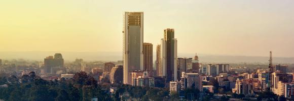
This data represents the distribution of human population between 1975 and 2030 in 5 year intervals over cells of 100x100 m size.
It derives from the GHS-POP - R2023A. Residential population estimates between 1975 and 2020 in 5-year intervals and projections to 2025 and 2030 derived from CIESIN GPWv4.11 were disaggregated from census or administrative units to grid cells, informed by the distribution, volume, and classification of built-up as mapped in the Global Human Settlement Layer (GHSL) global layer per corresponding epoch.
The dataset is part the Global Human Settlement Layer, that provide global, high-resolution, multi-temporal gridded data on built-up environment (built-up surface, built-up volume, residential vs. non-residential function), resident population, and settlement classification by the UN-recommended methodology “degree of urbanisation”. The complete information about the GHSL main products can be found in the GHSL Data Package 2023 report.
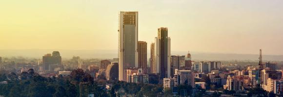
These layers present the application of the Degree of Urbanisation stage I methodology recommended by UN Statistical Commission to the global population grid generated by the JRC in the epochs 1975-2030 (5 years timestep).
They derive from the GHS-SMOD - R2023A.
The layers have been generated by integration of built-up surface extracted from Landsat and Sentinel-2 image data processing (GHS-BUILT-S R2023), and population data derived from the CIESIN GPW v4.11 (GHS-POP R2023).
The dataset is part the Global Human Settlement Layer, that provide global, high-resolution, multi-temporal gridded data on built-up environment (built-up surface, built-up volume, residential vs. non-residential function), resident population, and settlement classification by the UN-recommended methodology “degree of urbanisation”. The complete information about the GHSL main products can be found in the GHSL Data Package 2023 report.
This dataset compiles geophysical models detailing the thickness of the Earth's outer layers, ranging from surface sedimentary basins down to the base of the lithosphere. The collection serves a dual purpose: it provides broad, global baseline data for sediment distribution, while also offering high-resolution, integrated regional models specifically focused on the African plate.
Dataset Contents:
I. Global Baselines
II. African Regional Models
These layers are part of the Geothermal Atlas for Africa developed within the LEAP-RE project
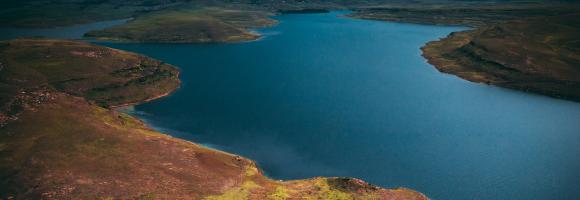
The current version of the GDW database (version 1.0) aims to catalogue all types of anthropogenic instream barriers. While initial mapping efforts prioritize major dams that form reservoirs, as well as run-of-river barriers on larger rivers where more information is readily available, the dataset comprises two distinct but interconnected spatial layers:
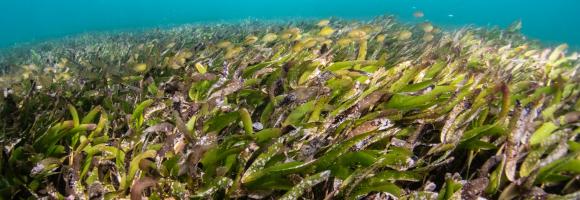
Seagrass is found on all continents except Antarctica, covering roughly 0.1% of the ocean floor. However, its global extent remains inadequately mapped, with estimates varying between 160,387 km² and 670,000 km², posing a significant challenge for conservation efforts. The UNEP-WCMC seagrass dataset indicates that Africa harbors approximately 12% of the world’s seagrass.
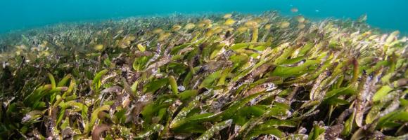
Seagrass is found on all continents except Antarctica, covering roughly 0.1% of the ocean floor. However, its global extent remains inadequately mapped, with estimates varying between 160,387 km² and 670,000 km², posing a significant challenge for conservation efforts. The UNEP-WCMC seagrass dataset indicates that Africa harbors approximately 12% of the world’s seagrass.
The Global Gridded Relative Deprivation Index (GRDI) characterizes the relative levels of multidimensional deprivation and poverty, where a value of 100 represents the highest level of deprivation and a value of 0 the lowest. GRDI is built from sociodemographic and satellite data inputs that were spatially harmonized, indexed, and weighted into six main components to produce the final GRDI layer.
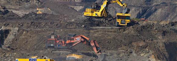
Mining has major economic, environmental and societal consequences, yet knowledge and understanding of its global footprint are still limited. These polygons represent the global mining land use detected via remote sensing analysis of high-resolution, publicly available satellite imagery. The dataset comprises 74,548 polygons, covering ~66,000 km2 of features like waste rock dumps, pits, water ponds, tailings dams, heap leach pads and processing/milling infrastructure.
The Great Green Wall (GGW) Initiative comprises 21 African countries and is implemented under the coordination of the African Union.

This dataset provides the global geographic distribution of key livestock species—cattle, sheep, and goats—for the year 2010, sourced from the Gridded Livestock of the World (GLW 3) database. Expressed as the total number of animals per pixel at a spatial resolution of 5 minutes of arc, these layers are essential for diverse applications in agricultural socio-economics, food security, environmental impact assessments, and epidemiology.
This dataset provides a continent-wide, raster-based spatial representation of groundwater resources across Africa for the year 2011, modeled under a historical baseline climate scenario. It is designed to support researchers, policymakers, and practitioners in mapping water availability, understanding baseline hydrogeological conditions, and assessing the intersection of natural water resources with climate and energy planning.
Sources and ContextThis layer was extracted from the Africa Groundwater Atlas of the British Geological Survey (BGS) in collaboration with the International Association of Hydrogeologists (IAH). The Atlas provides the expert continent-scale evidence base—including aquifer type, productivity, and groundwater status across 51 African countries—that makes robust spatial modeling of this kind possible.
This layer is part of the Geothermal Atlas for Africa developed within the LEAP-RE project

Percentage of healthcare facilities with electricity access in selected countries. Information on electricity access for healthcare facilities has been collected in the electricity access health facility database (EHFDB). The lower the healthcare facilities with access to electricity the greater the potential for decentralised renewable energies to improve electricity access in these facilities and thus healthcare outcomes.

Africa is considered one of the most vulnerable regions to weather and climate variability. Extreme events such as heat waves have important impacts on public health, water supplies, food security, and more generally on both regional economies and natural ecosystems. A prolonged period of hot days can feed wildfires, inhibit crop yields, or produce algae blooms with consequences on lakes oxygenation and, ultimately, fish mortality. Understanding of temperature extreme regime in Africa is necessary to assess the impacts of climate change on human and natural systems and to develop suitable adaptation and mitigation strategies at country level. A way to quantify heath waves is to use the Heat Wave Magnitude Index daily (HWMId). The HWMId is defined as the maximum magnitude of the heat waves in a year. Computed annually, this index takes into account both the duration and the intensity of extreme temperature events, and enables a comparison between heat waves with different timing and location. This dataset presents the number of years in the period 1981-2018 with a HWMId equal or superior to 4. It gives a general idea of the spatial distribution of heat waves with moderate intensity.
The application of fertiliser is a key component in increasing agricultural production. However, there are thresholds beyond which the cost of inputs fails to lead to corresponding increases in yield. Beyond economic inefficiency, overuse of commercial inorganic fertiliser can also result in a decline in soil condition and structure, including reduced soil carbon content, water-holding capacity and porosity, and to environmental pollution. This layer displays the areas of concern for high-input agriculture related issues derived from the convergence of global evidence of human-environment interactions that can have land degradation consequences.
This layer is part of the World Altas of Desertification

Number of deaths attributable to household air pollution resulting from solid fuels for cooking. Evidence from epidemiological studies have shown that exposure to smoke from incomplete combustion of solid fuels is linked with a range of conditions including acute and chronic respiratory diseases. Of these, evidence for three have been assessed on sufficiently strong basis for inclusion in the burden of disease estimates: acute lower respiratory infections in young children (under 5 years); chronic obstructive pulmonary disease in adults (above 25 years); lung cancer in adults (above 25 years).
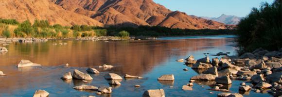
This dataset shows the location of hydrocarbon provinces with proven petroleum reserves. This data was compiled as part of the USGS's World Energy Project (WEP).
This dataset is part of the LEAP-RE project collection. For more information visit https://www.leap-re.eu/
Many African countries, especially in the Sub-Saharan region highly depend on hydropower which is one of the energy sources that are most affected by droughts. At the same time hydropower has a huge impact on water consumption (mainly through evaporation from reservoir surfaces) in comparison with other fuel types despite having higher densities of plants and installed capacities. Hydropower accounts for 15% of Africa’s energy production. This map shows the energy production (GWh) of hydropower plants with an installed capacity above 5MW, aggregated for each hydropower-generating country in Africa for year 2016.
The hydropower installed capacity indicates the amount of energy a hydropower plant can produce in its turbines. In 2016, hydropower accounted for 54% of the installed capacity in Eastern Africa, 58% in Central Africa and 30% in Western Africa with fourteen countries having a hydropower share above 50% and eight countries above 70%. These highly hydropower-dependent countries are particularly prone to electricity cuts due to the lack of water caused by severe droughts. This map shows the location and installed capacities of hydropower plants above 5MW installed capacity in Africa for year 2016, representing 95% of the total hydropower installed capacity in Africa.
Higher energy demands in Africa has led to a wide expansion of the number of hydropower sites, mainly between the 1960s and 1980s. The construction of dams causes impoundments of rivers and reservoirs in the regions of dam influence, with higher evaporation and water temperatures due to increased water surfaces. This map shows the he surface area (sqkm) of African reservoirs subject to hydropower production for the year 2016. It includes reservoirs of associated hydropower plants with installed capacities above 5MW. Apart from this, only reservoirs with a detected dam-caused impoundment of water surface are considered.
HydroRIVERS represents a vectorized line network of all global rivers that have a catchment area of at least 10 km² or an average river flow of at least 0.1 m³/sec, or both. HydroRIVERS only includes a limited amount of (mostly geometric) attribute information, such as the river reach length, the distance from upstream headwaters and ocean outlet, the river order, and an estimate of long-term average discharge. Every river reach is also co-registered to the sub-basin of the HydroBASINS database in which it resides (via a shared ID). Extracted from HydroSHEDS at 15 arc-second resolution, this layer is part of the HydroATLAS collection..

The IUCN IMMA layer identifies specific habitat areas crucial for one or more marine mammal species, which may be suitable for conservation through delineation and management. IMMAs represent regions that could benefit from targeted protection and/or monitoring. They serve as a marine mammal data layer highlighting important biodiversity, and potentially ecosystem health, which can be prioritized for protection and management by governments, intergovernmental organizations, conservation groups, and the public.
Smallholder farmers and pastoralists have restricted access to capital and may not have the capacity to invest in management practices that mitigate land degradation. This layer displays the areas of concern for the issues related to income level derived from the convergence of global evidence of human-environment interactions that can lead to land degradation.

The INFORM Risk Index 2021 is a composite model structured into a hierarchy of dimensions, categories, and components. All scores are normalized on a scale of 0 to 10 (10 being the highest risk).
Below is the clear breakdown of the index's architecture based on your descriptions:
The top-level score representing a country's overall risk of humanitarian crisis. It is used to assign countries into Risk Classes:
This dimension measures the predisposition of a population to be affected by a hazard based on economic, political, and social characteristics.
Sub-Index: Socio-Economic Vulnerability
An aggregate index covering three main components of systemic instability:
Sub-Index: Vulnerable Groups
Captures social groups with limited access to care and heightened susceptibility:
This dimension measures the ability of a country to manage and recover from disasters through its infrastructure and government effort.
Sub-Index: Institutional Capacity
Measures the "soft" infrastructure of a country's disaster management:
Sub-Index: Infrastructure
Measures the "hard" assets and systems available during a crisis:
In 2020, a group of researchers carried out analysis to examine the importance of Indigenous Peoples’ lands for preserving Intact Forest Landscapes.(Fa et al.2020)They used geospatial data on the extent of Indigenous Peoples’ lands reported by Garnett et al. (2018), and Geospatial data for IFLs were sourced from the Intact Forest Landscapes website (www.intactforests.org) for the years 2000, 2013, and 2016 (Potapov et al. 2017)In the paper they have shown that the proportion of Indigenous Peoples’ lands mapped as IFLs was considerably higher (10.9%) than the proportion of other lands (defined here as all land outside Indigenous Peoples’ lands) mapped as IFLs (6.8%).
In this map we reported the percentage of Intact Forest Lansdcapes reduction in Indigenous People Lands for the period 2000-2016. IN the table we reported also the percentage of IFLs reduction in other lands. To explore more IFLs conservation strategies for African, Caribbean and Pacific countries you can check BIOPAMA Geonode Layers
Sources:
Fa JE, Watson JE, Leiper I, Potapov P, Evans TD, Burgess ND, Molnár Z, Fernández‐Llamazares Á, Duncan T, Wang S, Austin BJ. Importance of Indigenous Peoples’ lands for the conservation of Intact Forest Landscapes. Frontiers in Ecology and the Environment. 2020 Apr;18(3):135-4

The International Wealth Index is an asset-based wealth index that runs from 0 (no assets) to 100 (all assets) and is comparable across place and time. The lower the level of the Index, the greater the potential of electricity access to reduce poverty and foster development.
Irrigation enables farmers to increase crop production by reducing their dependence on natural rainfall. It is considered a vital part of ensuring food security in the future. Yet it also causes extensive environmental damage and undermines human resilience to water scarcity. Irrigation is responsible for 70 % of all freshwater withdrawals in the globe. Human induced salinisation is a widespread problem as around 30 % of irrigated land are affected and becoming commercially unproductive. This layer displays the areas of concern for irrigation related issues, derived from the convergence of global evidence of human-environment interactions that can have land degradation consequences.
This layer is part of the World Altas of Desertification
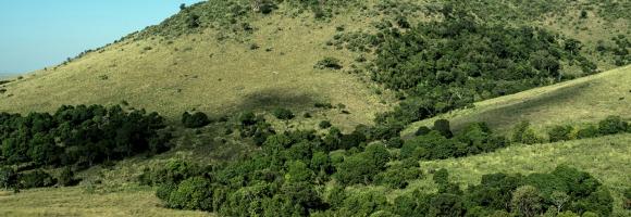
The EC JRC global map of forest cover provides a spatially explicit representation of forest presence and absence for the year 2020 at 10m spatial resolution.
The year 2020 corresponds to the cut-off date of the Regulation from the European Union "on the making available on the Union market and the export from the Union of certain commodities and products associated with deforestation and forest degradation" (EUDR, Regulation (EU) 2023/1115). In the context of the EUDR, the global forest cover map can be used as a non-mandatory, non-exclusive, and not legally binding source of information. Further information about the map and its use can be found on the EU Observatory on Deforestation and Forest Degradation (EUFO) in the section on Frequently Asked Questions.
Forest means land spanning more than 0.5 hectares with trees higher than 5 meters and a canopy cover of more than 10%, or trees able to reach those thresholds in situ, excluding land that is predominantly under agricultural or urban land use. Agricultural use means the use of land for the purpose of agriculture, including for agricultural plantations (i.e. tree stands in agricultural production systems such as fruit tree plantations, oil palm plantations, olive orchards and agroforestry systems) and set- aside agricultural areas, and for rearing livestock. All plantations of relevant commodities other than wood, that is cattle, cocoa, coffee, oil palm, rubber, soya, are excluded from the forest definition.
The global map of forest cover was created by combining available global datasets (wall-to-wall or global in their scope) on tree cover, tree height, land cover and land use into a single harmonized globally-consistent representation of where forests existed in 2020.
The workflow consisted in first mapping the global maximum extent of tree cover circa the year 2020 from the combination of ESA World Cover 2020 and 2021, WRI Tropical Tree Cover 2020, UMD Global land cover and land use 2019, Global Mangrove Watch 2020, and JRC Tropical Moist Forest 2020 datasets. In the second step, a series of overlays and decision rules were applied to reduce this maximum extent of tree cover and align it with the Forest definition using datasets covering cropland and commodity expansion (ESA World Cereal, UMD Global land cover and land use 2019, UMD Global Cropland Expansion, High-resolution global map of smallholder and industrial oil palm plantations, and WRI Spatial Database of Planted Trees), land use change (UMD global forest cover loss, JRC Tropical Moist Forest, IIASA Global Forest Management), built-up (JRC Global Human Settlement), and water (JRC Global Surface Water).
The detailed mapping approach will be described in a separate technical report expected to be released by March 2024. The accuracy of this map has not been yet assessed but will be reported as soon as available.
Please also refer to the list of known issues and to the JRC Data Catalogue entry.

Key Biodiversity Areas (KBAs) are the most important places in the world for species and their habitats. Faced with a global environmental crisis we need to focus our collective efforts on conserving the places that matter most. The KBA Programme supports the identification, mapping, monitoring and conservation of KBAs to help safeguard the most critical sites for nature on our planet – from rainforests to reefs, mountains to marshes, deserts to grasslands and to the deepest parts of the oceans. By providing the precise location of places that contribute significantly to the global persistence of biodiversity, KBAs can accelerate efforts to reverse the loss of nature, by ensuring conservation efforts are focussed in the places that matter most, and by enabling entities that may have negative impacts on nature to avoid or reduce those impacts in the places they would be most damaging. This layer shows the location of the KBAs, identified and mapped by the KBA partnership.
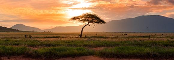
Some areas in Africa represent spectacular, still viable examples of Africa’s wildlife and wild places. They are of such outstanding importance and value that they should be conserved at all costs and in principle forever. Those areas are referred to as Key Landscapes for Conservation or KLCs. A suitable network of KLCs has the potential to protect the well-known wildlife species within natural ecosystems and to stimulate rural economic growth.

<p>This spatial dataset contains the geographic boundaries and ecological evaluations of 45 Key Landscapes for Conservation and Development (KLCDs) across Sub-Saharan Africa. Building on the <a href="https://africa-knowledge-platform.ec.europa.eu/dataset/key-landscapes-c…; Key Landscapes for Conservation (KLCs) </a> identified in the EU report <a href="https://op.europa.eu/sl/publication-detail/-/publication/d76ac7eb-bc4a-…;“Larger than elephants”</a>, the NaturAfrica initiative is rolled out across these key biodiversity and development landscapes.</p>
<p>NaturAfrica's efforts are concentrated on ‘mega-landscapes’—biogeographical regions identified as crucial for both conservation and development. These regions encompass:</p>
<ul>
<li>The forest ecosystems of the Congo Basin;</li>
<li>Landscapes of transhumance pastoralists in North Cameroon, the Central African Republic, and Chad;</li>
<li>Guinean forests of West Africa;</li>
<li>Savannahs in the Sudano-Sahelian zone of West Africa;</li>
<li>Savannahs and watersheds of the East Africa rift;</li>
<li>Transfrontier conservation areas of Southern Africa.</li>
</ul>
<p>The layer was developed to support the prioritization of intervention areas for the second phase of this initiative, which combines conservation with sustainable job creation. It provides a spatially explicit characterization of ecological value across these landscapes, evaluated and attributed based on five core ecological and environmental dimensions:</p>
<ul>
<li><span class="label">Threatened Species Richness:</span> Concentration and diversity of threatened species.</li>
<li><span class="label">Species Endemicity:</span> Presence of endemic species unique to the specific geographic region.</li>
<li><span class="label">Ecosystem Integrity:</span> The integrity of protected and conserved areas, accounting for degrees of human modification and habitat fragmentation.</li>
<li><span class="label">Ecological Connectivity:</span> The degree of connectivity and spatial linkages between protected and conserved areas.</li>
<li><span class="label">Ecosystem Services:</span> Provisioning and regulating services, with a specific focus on carbon storage and water services.</li>
</ul>
<strong>Purpose</strong>
<p>The layer was created to inform the EC Directorate General for International Partnerships (DG INTPA) and policymakers in selecting and prioritizing funding intervention areas based on specific targets (e.g., species conservation, connectivity, or water security) within different biogeographical regions. It serves as a spatial decision-support tool to align with the European Green Deal and the EU Biodiversity Strategy for 2030.</p>
<strong>Geographic Extent</strong>
<ul>
<li><span class="label">Region:</span> Sub-Saharan Africa</li>
<li><span class="label">Coverage:</span> 45 distinct Key Landscapes for Conservation and Development (KLCDs)</li>
</ul>
<strong>Keywords</strong>
<ul>
<li><span class="label">Thematic:</span> Biodiversity Conservation, NaturAfrica, Ecosystem Services, Protected Areas, Habitat Connectivity, Species Endemicity, European Green Deal, Ecosystem Integrity, Transfrontier Conservation, Mega-landscapes.</li>
<li><span class="label">Spatial:</span> Sub-Saharan Africa, Congo Basin, West Africa, East Africa, Southern Africa, Sudano-Sahelian zone.</li>
</ul>
<strong>Lineage / Data Source</strong>
<p>This dataset is derived from the <a href="https://publications.jrc.ec.europa.eu/repository/handle/JRC145021"> technical assessment conducted for the European Commission Knowledge Centre for Biodiversity (KCBD) </a>.</p>
Land cover is defined as the physical material at the surface of the earth, usually documented via the interpretation of earth observations. Common land cover types include trees, grass, bare ground, built up areas, water, etc. How well are different ecosystem types (as indicated by land cover) preserved and how strong are anthropogenic changes affecting their distribution in a given area? Human pressures are constantly increasing and it is important to monitor the consequences of the associated changes on the environment. This map shows the changes in land cover between 1995 and 2015.
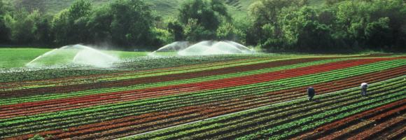
Humans need increasingly more biomass for food, fodder, fiber and energy. In Africa, circa 22% of the vegetated land surface showed a decline or unstable land productivity between 1999 and 2013. Persistent reduction of land productivity points to long-term alteration of the health and productive capacity of the land, which are characteristic of land degradation. It has impact on ecosystem services and benefits, thus on the sustainable livelihoods of human communities. This map shows the dynamics of (vegetated) land productivity over a time period, in other terms the trajectories of above-ground biomass. It reflects changes in ecosystem functioning e.g. vegetation growth cycles due to natural variation and/or human intervention, and can be associated with processes of land degradation or recovery. The 5 classes depict two levels of persistent productivity decline, one level of instability or stress in capacity, one level of stable productivity and one level of increased productivity.
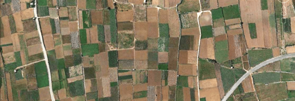
Habitat fragmentation occurs when natural habitat is broken up by non-natural land uses. For this layer, land fragmentation is expressed as the Natural Land Cover Pattern Index (NLPI), which classifies natural or semi-natural landcover into six spatial pattern classes: core, edge, perforation, islet, margin, and core-opening. Natural landcover pixels from Climate Change Initiative Land Cover (CCI-LC) raster maps are classified as ‘core’ habitat. Non-natural land cover pixels within core habitat are classified as ‘core openings’ as these represent openings from within natural habitat. External interfaces between core and non-natural landcover are classified as ‘edges’ (i.e. exposed to outside-in habitat loss pressures), while internal interfaces between core and core-openings are classified as ‘perforations’ (i.e. exposed to inside-out habitat loss pressure). Collections of isolated natural landcover pixels that are too small to contain core habitat are classified as ‘islets’, while similarly small collections of pixels are classified as ‘margins’ when they are connected to core habitats.
Humans need increasingly more biomass for food, fodder, fiber and energy. In Africa, circa 22% of the vegetated land surface showed a decline or unstable land productivity between 1999 and 2013. Persistent reduction of land productivity points to long-term alteration of the health and productive capacity of the land, which are characteristic of land degradation. It has impact on ecosystem services and benefits, thus on the sustainable livelihoods of human communities. This map shows the dynamics of (vegetated) land productivity over a time period, in other terms the trajectories of above-ground biomass. It reflects changes in ecosystem functioning e.g. vegetation growth cycles due to natural variation and/or human intervention, and can be associated with processes of land degradation or recovery. The 5 classes depict two levels of persistent productivity decline, one level of instability or stress in capacity, one level of stable productivity and one level of increased productivity.

Percentage of women who are literate. This indicator highlights the importance of electricity for women, who spend the majority of their time taking care of the households. Electricity can ease girls and young women from houdeholds duties and allow them to attend schools. Thus, the lower the number of households with access to electricity the greater the potential for decentralised renewable energies to improve literacy levels among women.

Adult literacy rate is the percentage of people ages 15 and above who can both read and write with understanding a short simple statement about their everyday life. Literacy statistics for most countries cover the population ages 15 and older, but some include younger ages or are confined to age ranges that tend to inflate literacy rates. The youth literacy rate for ages 15-24 reflects recent progress in education. It measures the accumulated outcomes of primary education over the previous 10 years or so by indicating the proportion of the population who have passed through the primary education system and acquired basic literacy and numeracy skills.
The Dead Wood Carbon and Litter Carbon pools have been estimated at global level as constant fractions of ESA Biomass CCI Above Ground Biomass (AGB), v.3 (2018) using a lookup table based on global ecological zone, elevation and precipitation regime, as proposed by Harris, N.L., Gibbs, D.A., Baccini, A. et al. Global maps of twenty-first century forest carbon fluxes. Nat. Clim. Chang. 11, 234–240 (2021). https://doi.org/10.1038/s41558-020-00976-6

Poverty affects billions of people around the globe. On a daily basis, they face low wages and substandard health, education, and living standards. Because of this, poverty must be understood and approached as a multidimensional issue. The Multidimensional Poverty Index (MPI) acknowledges that poverty has many faces. The third and last dimension in the MPI is the Living Standard dimension. This includes access to electricity, improved sanitation services and safe drinking water, flooring, cooking fuel, and assets ownership. This map shows the percentage contribution of the Living Standards Dimension to the overall poverty index. The lower percentages are shown in darker greens while the higher percentages are shown as brighter, lighter greens.
Given the massive scale of livestock production systems, it is unlikely that any other single human activity has a larger environmental impact on the terrestrial land mass of the planet. As the world’s largest user of land, livestock production has a huge footprint, affecting many components of the global environment. In many developing countries, the per-capita consumption of livestock foodstuffs is projected to continue to rise. This layer displays the areas of concern for livestock density related issues, derived from the convergence of global evidence of human-environment interactions. The density of livestock is related to environmental pressures from livestock related land use change, grazing lands and fodder production, and greenhouse gas emissions.
Smallholder farmers have limited access to capital and are reluctant to trade their low-risk system (low input and low yield) to a high-risk system (high input and potentially higher yields). But Insufficient application of fertilizer on agricultural land may lead to soil nutrients depletion, lower yields, and eventually land abandonment. This layer displays the areas of concern for low-input agriculture related issues derived from the convergence of global evidence of human-environment interactions that can have land degradation consequences.

This layer provides estimates of the percentage of children aged 2 to 10 years (PfPR2–10) with detectable Plasmodium falciparum parasites in 2022. The estimates are generated using geostatistical models based on point prevalence surveys, routine surveillance data, and a wide range of geospatial covariates representing mosquito habitat and environmental conditions. The data are available annually from 2000 onward, covering all malaria-endemic countries, at a spatial resolution of 5 × 5 km.
Malaria, a life-threatening disease transmitted by mosquitoes, affects millions of people worldwide. This layer highlights malaria rates among children age 2 to 10 in Sub-Saharan Africa in 2015.
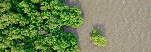
Mangroves are trees or shrubs adapted to saline and brackish environments. They are found in the intertidal zone of tropical and sub-tropical coastlines. Mangrove forests are among the most productive ecosystems on earth. They serve many important functions, including water filtration, prevention of coastal erosion, carbon storage, food, timber and livelihood provision, and biodiversity protection (as they provide habitat, nurseries, and feeding grounds for a vast array of organisms). Despite their incredible value, mangrove forests are destroyed and degraded at a rate of about 1% per year as a result of land use change, exploitation, coastal development and climate change. This layer shows the change in mangrove extent -either stable, gain or loss- between 1996 and 2016.
The map is based on Copernicus Global Land Cover data which shows actual land cover (what physically covers land across the globe—forests, grasslands, croplands, lakes, wetlands, built-up area, etc) at 100m x 100m resolution. The land cover data for Africa was overlaid on (high resolution) satellite imagery of Africa, which is then used to determine the land use (by visual interpretation) associated with the various land cover patterns on the Copernicus Global Land Cover map.
Copernicus land cover data offers several advantages: it is of high quality, has a high resolution (100m x 100m), and offers time series satellite imagery. More importantly, the Copernicus Global Land Service is a continuous process and its datasets are updated annually. This means that the Soils4Africa map of agricultural land can be updated every time the land cover data for the new year becomes available (the map is currently based on 2019 data).
The Copernicus dataset already includes the category ‘cropland,’ which by definition is part of agricultural land. The Soils4Africa map broadens the scope of that dataset by infering information on agricultural use and including other kinds of agricultural land use such as grazing pastures and plantations.
When land is mapped as other than ‘cropland'-- like ‘shrubland’ for example-- it is more difficult to interpret and determine whether it is under agricultural use. The Copernicus dataset includes information about ‘fractional cover’-- or the percentage of a particular pixel under a particular kind of land cover (for example, 30% of a 100m x 100m pixel could be forest and 20% could be shrubland). The Soils4Africa map takes into account how fractional cover varies over an area to establish rules for interpreting its land cover data to determine whether it is under agricultural use and for what purpose. These rules were validated by comparing it with ground level information on land use (or land use pattern) for specific areas drawn from the interpretation of satellite imagery from Google Earth.
For example, ground-level observation shows that forest cover upwards of 30% in a given area when matched by shrubland cover of over 30%, is characterized by woody vegetation with a smooth canopy. Therefore, such area is more likely to be under plantations rather than natural forest. Thus, such an area should be counted as agricultural land, even if less than 15% of it is under crops.
Critical natural assets are defined as the natural and semi-natural terrestrial and aquatic ecosystems required to maintain 12 of nature’s ‘local’ contributions to people (local NCP) in the ocean (blue). 12 Local NCP for key benefits like security in food, water, hazards, material and culture. as follows: for food, pollinator habitat sufficiency ofr pollination dependent crop production, fodder production for livestock, wild riverine and marine fish catch ; for water, water quality regulation, via sediment retention and nutrient retention; for natural hazards, flood risk reduction and coastal risk reduction. For materials, timber production, fuelwood production and access to nature. For cultural benefits, coral reef tourism and access to nature for recreation or other uses. Criticality of the natural assets was defined on the basis of the highest value areas across all NCPs, the magnitude of benefits and the number of beneficiaries. Cropland, urban areas, bare areas and permanent snow and ice are excluded from the analysis.
The Marine Ecoregions of the World is a global system to classify the oceans, helping to plan and prioritise marine conservation measures. How much are marine areas are protected at ecoregion level? For each African marine ecoregion, this map shows the percentage covered by protected areas.

Number of maternal deaths during a given time period per 100 000 live births during the same time period. The lower the number of healthcare facilities with access to electricity the greater the potential for decentralised renewable energies to reduce maternal mortality.
This data set provides spatially explicit estimates of the area directly used for surface mining on a global scale. It contains 44,929 polygon features, covering 101,583 km² of land used by the global mining industry, including large-scale and artisanal and small-scale mining. The polygons cover all ground features related to mining, .e.g open cuts, tailing dams, waste rock dumps, water ponds, processing infrastructure, and other land cover types related to the mining activities.
This dataset provides mobile (cellular) network performance metrics in zoom level 16 web Mercator tiles (approximately 610.8 meters by 610.8 meters at the equator). Download speed is collected via the Speedtest by Ookla applications for Android and iOS and averaged for each tile. Measurements are filtered to results containing GPS-quality location accuracy. Speedtest data is used today by commercial mobile network operators around the world to inform network buildout, improve global Internet quality, and increase Internet accessibility. This data can be used for rural and urban connectivity development, to help make the internet better, faster, and more accessible for everyone.
This dataset provides mobile (cellular) network performance metrics in zoom level 16 web Mercator tiles (approximately 610.8 meters by 610.8 meters at the equator). Download speed is collected via the Speedtest by Ookla applications for Android and iOS and averaged for each tile. Measurements are filtered to results containing GPS-quality location accuracy. Speedtest data is used today by commercial mobile network operators around the world to inform network buildout, improve global Internet quality, and increase Internet accessibility. This data can be used for rural and urban connectivity development, to help make the internet better, faster, and more accessible for everyone.
Chlorophyll-a concentrations (Chla) are an indicator of phytoplankton abundance and biomass in open waters. They can be an effective measure of trophic status and are commonly used to measure water quality. This layer compares the Chla value from the last full month with the long-term mean Chla. A positive anomaly (warm colours) means the monthly Chla is higher than the long-term average for that month; a negative anomaly (cool colours) means it is lower than the average.

Monitoring of sea surface temperature (SST) provides fundamental information on the global climate system and for the study of marine ecosystems. This layer compares the SST value of the last full month with the long-term mean SST. A positive anomaly (warm colours) means the monthly SST is warmer than the long-term average for that month; a negative anomaly (cool colours) means it is cooler than the average.
This dataset compiles global and regional models of the Mohorovičić discontinuity (Moho) depth from 2019 to 2022, providing key insights into crustal thickness and lithospheric boundaries. All layer values are expressed in kilometers (km). It includes the Moho Depth (Finger et al., 2022) map, which details the boundary derived from S-wave seismic tomography data, alongside its corresponding Moho Depth Uncertainty layer to highlight spatial confidence and data reliability. Additionally, it features the Global Moho Depth (Szwillus et al., 2019) map, derived using a nonstationary kriging algorithm (Risser & Calder, 2017), which serves as an excellent comparative baseline for structural, geophysical, and tectonic analysis.
These layers are part of the Geothermal Atlas for Africa developed within the LEAP-RE project
Increasing water scarcity and water quality issues are serious constraints in Africa and worldwide. Measuring precipitation anomalies is important for detecting and characterizing meteorological droughts, and, in the agricultural sector especially, for effectively managing climate related uncertainties. This layer shows the deviation of the precipitations of the last full month from the long-term average of the same month. A positive anomaly (shades of blue) means there was more rainfall than average during that month. A negative anomaly (yellow to red) means there was less rainfall than average during that month.
The United Nations Educational, Scientific and Cultural Organization (UNESCO) seeks to encourage the identification, protection and preservation of natural heritage around the world considered to be of outstanding value to humanity. This is embodied in an international treaty called the Convention concerning the Protection of the World Cultural and Natural Heritage, adopted by UNESCO in 1972. What makes the concept of World Heritage exceptional is its universal application. World Heritage sites belong to all the peoples of the world, irrespective of the territory on which they are located.
From the new available dataset in GFW on tree cover change between 2000 and 2020, here we are displaying the net change in tree cover by percent for country.The net change in tree cover corresponds to the area of gross gain minus the area of gross loss to show the overall change (negative or positive). The attribute table provides also statistics on net change in tree cover such stable forest or disturbed forest(in hectars).
This dataset is accessed through Global Forest Watch on 04/10/2022. www.globalforestwatch.org.
Potapov, P., Hansen, M.C., Pickens, A., Hernandez-Serna, A., Tyukavina, A., Turubanova, S., Zalles, V., Li, X., Khan, A., Stolle, F., Harris, N., Song, X-P., Baggett, A., Kommareddy, I., and Kommareddy, A. 2022. The Global 2000-2020 Land Cover and Land Use Change Dataset Derived From the Landsat Archive: First Results. Frontiers in Remote Sensing, 13, April 2022. https://doi.org/10.3389/frsen.2022.856903; summarized by administrative area at WRI

Net official development assistance (ODA) is government aid designed to promote the economic development and welfare of developing countries. Aid may be provided bilaterally, from donor to recipient, or channelled through a multilateral development agency such as the United Nations or the World Bank. Net official aid (OA) refers to aid flows from official donors to more advanced (developing) countries and territories. Official aid is provided under terms and conditions similar to those for ODA. This map shows the aggregated figure (sum of ODA and OA) for African countries. Data are in current U.S. dollars.
Oil seed crops, especially oil palm, are among the most rapidly expanding agricultural land uses, and their expansion is known to cause significant environmental damage. Accordingly, these crops often feature in public and policy debates, which are hampered or biased by a lack of accurate information on environmental impacts. This dataset presents a global crop map. It covers areas where oil palm plantations were detected at global scale, and includes industrial and smallholder mature oil palm plantations.

This layer shows the percentage of children under 6 months who are exclusively breastfed, meaning they receive only breast milk without any additional food or drink. Exclusive breastfeeding is a key determinant of child survival, growth, and development.
The human imprint on the planet has a major impact on the functioning of the Earth system. Because the impact on the environment is closely intertwined with population dynamics, it is important to monitor and include these in the evaluation of land degradation. This layer displays the areas of concern for population change related issues derived from the convergence of global evidence of human-environment interactions that can lead to land degradation. It reflects the dynamics of increasing number of people in a certain area.
This layer is part of the World Altas of Desertification
According to UN estimates, the global population will increase by 2.4 billion between 2015 and 2050. Of this, an overwhelming 50 % will be concentrated in Africa (1.3 billion). There could be up to four times as many people in sub-Saharan Africa by the end of the century. The human imprint on the planet has a major impact on the functioning of the Earth system. Because the impact on the environment is closely intertwined with population dynamics, it is important to monitor and include these in the evaluation of land degradation. This layer displays the areas of concern for population density related issues derived from the convergence of global evidence of human-environment interactions that can lead to land degradation.
Constrained estimates of the total number of people per spatial unit, derived from high-resolution population distribution data produced by the WorldPop Global Demographic Data project. These estimates are based on a 30-arcsecond (~1 km) resolution modeling framework and incorporate official census counts, administrative boundaries, and a suite of geospatial covariates.
Substantial crop losses occur at various stages along the postharvest value chain. Losses result from poor handling and storage practices combined with limited awareness, infrastructure, and knowledge. The African Postharvest Losses Information System (APHLIS) (www.aphlis.net) is the foremost international effort to collect, analyse and disseminate data on postharvest losses of cereal grains in sub-Saharan Africa. The cumulative % loss in weight incurred during harvesting, drying, threshing/shelling, winnowing, household-level storage, transport and market-level storage for the selected crop, location, and year is presented. Complimentary data sets are collected and used to convert this % loss into absolute loss values in tonnes, US$ and nutrients, along with the nutritional and financial impacts of these losses by province and country. Understanding the magnitude of postharvest loss, the points in the value chain where losses occur, and the causes and impacts of loss helps decision-makers formulate effective policies and invest in successful postharvest loss programmes.
Substantial crop losses occur at various stages along the postharvest value chain. Losses result from poor handling and storage practices combined with limited awareness, infrastructure, and knowledge. The African Postharvest Losses Information System (APHLIS) (www.aphlis.net) is the foremost international effort to collect, analyse and disseminate data on postharvest losses of cereal grains in sub-Saharan Africa. The cumulative % loss in weight incurred during harvesting, drying, threshing/shelling, winnowing, household-level storage, transport and market-level storage for the selected crop, location, and year is presented. Complimentary data sets are collected and used to convert this % loss into absolute loss values in tonnes, US$ and nutrients, along with the nutritional and financial impacts of these losses by province and country. Understanding the magnitude of postharvest loss, the points in the value chain where losses occur, and the causes and impacts of loss helps decision-makers formulate effective policies and invest in successful postharvest loss programmes.
Substantial crop losses occur at various stages along the postharvest value chain. Losses result from poor handling and storage practices combined with limited awareness, infrastructure, and knowledge. The African Postharvest Losses Information System (APHLIS) (www.aphlis.net) is the foremost international effort to collect, analyse and disseminate data on postharvest losses of cereal grains in sub-Saharan Africa. The cumulative % loss in weight incurred during harvesting, drying, threshing/shelling, winnowing, household-level storage, transport and market-level storage for the selected crop, location, and year is presented. Complimentary data sets are collected and used to convert this % loss into absolute loss values in tonnes, US$ and nutrients, along with the nutritional and financial impacts of these losses by province and country. Understanding the magnitude of postharvest loss, the points in the value chain where losses occur, and the causes and impacts of loss helps decision-makers formulate effective policies and invest in successful postharvest loss programmes.
Substantial crop losses occur at various stages along the postharvest value chain. Losses result from poor handling and storage practices combined with limited awareness, infrastructure, and knowledge. The African Postharvest Losses Information System (APHLIS) (www.aphlis.net) is the foremost international effort to collect, analyse and disseminate data on postharvest losses of cereal grains in sub-Saharan Africa. The cumulative % loss in weight incurred during harvesting, drying, threshing/shelling, winnowing, household-level storage, transport and market-level storage for the selected crop, location, and year is presented. Complimentary data sets are collected and used to convert this % loss into absolute loss values in tonnes, US$ and nutrients, along with the nutritional and financial impacts of these losses by province and country. Understanding the magnitude of postharvest loss, the points in the value chain where losses occur, and the causes and impacts of loss helps decision-makers formulate effective policies and invest in successful postharvest loss programmes.
Substantial crop losses occur at various stages along the postharvest value chain. Losses result from poor handling and storage practices combined with limited awareness, infrastructure, and knowledge. The African Postharvest Losses Information System (APHLIS) (www.aphlis.net) is the foremost international effort to collect, analyse and disseminate data on postharvest losses of cereal grains in sub-Saharan Africa. The cumulative % loss in weight incurred during harvesting, drying, threshing/shelling, winnowing, household-level storage, transport and market-level storage for the selected crop, location, and year is presented. Complimentary data sets are collected and used to convert this % loss into absolute loss values in tonnes, US$ and nutrients, along with the nutritional and financial impacts of these losses by province and country. Understanding the magnitude of postharvest loss, the points in the value chain where losses occur, and the causes and impacts of loss helps decision-makers formulate effective policies and invest in successful postharvest loss programmes.
This dataset shows the African power plants by energy generation type. It includes thermal plants (coal, gas, oil, nuclear, biomass, waste, geothermal) and renewables (hydro, wind, solar). Each power plant is geolocated and entries contain information on plant capacity and generation type.
This dataset shows the African power plants and their installed capacity in MegaWatt (MW). It includes thermal plants (coal, gas, oil, nuclear, biomass, waste, geothermal) and renewables (hydro, wind, solar). Each power plant is geolocated and entries contain information on plant capacity and generation.
Priority areas are identified using local coefficients estimated through Geographically Weighted Regression (GWR), which measures the spatially varying relationship between access to electricity and education using the indicator of percentage of population with secondary education .
The tool highlights locations where the local association between electricity access and the selected nutrition indicator is both negative and statistically significant. In this application, priority areas are further restricted to locations where electricity access is below 80%, ensuring that the results remain relevant for policy intervention.
The identified areas are classified as having strong, moderate, or mild associations according to the magnitude of the local GWR coefficient. This classification helps users determine the appropriate intensity of intervention. The spatially varying coefficients therefore allow users to identify areas where limited electricity access is most strongly associated with higher education, supporting targeted interventions, programme planning, and place-based development strategies.
Priority areas are identified using local coefficients estimated through Geographically Weighted Regression (GWR), which measures the spatially varying relationship between access to electricity and gender using the indicator of proportion of women with secondary school. The tool highlights locations where the local association between electricity access and the selected nutrition indicator is both negative and statistically significant. In this application, priority areas are further restricted to locations where electricity access is below 80%, ensuring that the results remain relevant for policy intervention. The identified areas are classified as having strong, moderate, or mild associations according to the magnitude of the local GWR coefficient. This classification helps users determine the appropriate intensity of intervention. The spatially varying coefficients therefore allow users to identify areas where limited electricity access is most strongly associated with lower proportion of women at secondary school, supporting targeted interventions, programme planning, and place-based development strategies.
Priority areas are identified using local coefficients estimated through Geographically Weighted Regression (GWR), which measures the spatially varying relationship between access to electricity and health using the indicator of under-5 mortality.
The tool highlights locations where the local association between electricity access and the selected nutrition indicator is both negative and statistically significant. In this application, priority areas are further restricted to locations where electricity access is below 80%, ensuring that the results remain relevant for policy intervention.
The identified areas are classified as having strong, moderate, or mild associations according to the magnitude of the local GWR coefficient. This classification helps users determine the appropriate intensity of intervention. The spatially varying coefficients therefore allow users to identify areas where limited electricity access is most strongly associated with higher mortality among children under five, supporting targeted interventions, programme planning, and place-based development strategies.

Priority areas are identified using local coefficients estimated through Geographically Weighted Regression (GWR), which measures the spatially varying relationship between access to electricity and four nutrition indicators among children under five: stunting, wasting, severe wasting, and underweight.
The tool highlights locations where the local association between electricity access and the selected nutrition indicator is both negative and statistically significant. In this application, priority areas are further restricted to locations where electricity access is below 80%, ensuring that the results remain relevant for policy intervention.
The identified areas are classified as having strong, moderate, or mild associations according to the magnitude of the local GWR coefficient. This classification helps users determine the appropriate intensity of intervention. The spatially varying coefficients therefore allow users to identify areas where limited electricity access is most strongly associated with poorer nutritional outcomes among children under five, supporting targeted interventions, programme planning, and place-based development strategies.
Priority areas are identified using local coefficients estimated through Geographically Weighted Regression (GWR), which measures the spatially varying relationship between access to sanitation infrastructure and education using the indicator of percentage of population with secondary education . The tool highlights locations where the local association between electricity access and the selected nutrition indicator is both negative and statistically significant. The identified areas are classified as having strong, moderate, or mild associations according to the magnitude of the local GWR coefficient. This classification helps users determine the appropriate intensity of intervention. The spatially varying coefficients therefore allow users to identify areas where limited sanitation access is most strongly associated with lower education, supporting targeted interventions, programme planning, and place-based development strategies.
Priority areas are identified using local coefficients estimated through Geographically Weighted Regression (GWR), which measures the spatially varying relationship between access to sanitation infrastructure and gender using the indicator of percentage of women with secondary education. The tool highlights locations where the local association between sanitation access and the selected gender indicator is both negative and statistically significant. The identified areas are classified as having strong, moderate, or mild associations according to the magnitude of the local GWR coefficient. This classification helps users determine the appropriate intensity of intervention. The spatially varying coefficients therefore allow users to identify areas where limited sanitation access is most strongly associated with lower women education, supporting targeted interventions, programme planning, and place-based development strategies.

Priority areas are identified using local coefficients estimated through Geographically Weighted Regression (GWR), which measures the spatially varying relationship between access to sanitation and four nutrition indicators among children under five: stunting, wasting, severe wasting, and underweight.
The tool highlights locations where the local association between sanitation access and the selected nutrition indicator is both negative and statistically significant. In this application, priority areas are further restricted to locations where sanitation access is below 80%, ensuring that the results remain relevant for policy intervention.
The identified areas are classified as having strong, moderate, or mild associations according to the magnitude of the local GWR coefficient. This classification helps users determine the appropriate intensity of intervention. The spatially varying coefficients therefore allow users to identify areas where limited sanitation access is most strongly associated with poorer child nutrition outcomes, supporting targeted interventions, programme planning and place-based development strategies.

Percentage of women who experienced physical or sexual violence. This indicator focuses on the importance of bringing electricity to public infrastructures, in particular streets. Improving street lighting can make these infrastructures safer especially for women and thus reduce the number of women who experienced any type of violence in public spaces.
Shapefile showing the location of protected areas in Africa as national parcs and natural reserves.
This dataset provides projections of global rainfall erosivity changes, a critical metric representing the erosive force of rainfall that drives worldwide soil and nutrient loss. These maps serve as essential inputs for global and regional soil erosion assessment models. The collection details the geographical distribution of projected erosivity changes across two primary periods: 2010–2050 and 2050–2070. To account for different climate trajectories, the dataset includes models for three distinct Representative Concentration Pathway (RCP) scenarios for both timeframes: RCP 2.6 (stringent mitigation), RCP 4.5 (intermediate emissions), and RCP 8.5 (high emissions). By combining these temporal and climatic variables, users can evaluate and compare potential future soil erosion risks under varying degrees of global climate change.
By detecting areas where agricultural production deficits might occur, it is possible to prevent food security crises and anticipate response planning. To do this, we need accurate and reliable information on agricultural land cover. This layer shows the extent of rangeland in Africa. Each pixel represents the fraction of the area covered by rangeland (i.e. the percentage of the pixel with rangeland).
Raw materials are essential for the sustainable functioning of modern societies and their industries. The European Commission's Raw Materials Information System (RMIS) is developed by the Joint Research Centre (JRC) in cooperation with the DG for Internal Market, Industry, Entrepreneurship and SMEs (GROWTH). The RMIS is the Commission’s reference web-based knowledge platform on non-fuel, non-agricultural raw materials from primary and secondary sources. From gold to natural rubber, including cobalt, cooking coal, construction aggregates (sand, gravel...) and many more, it focuses on both abiotic and biotic materials, covering the entire value chain. This map shows the amount (in USD) of the main non-food, non-energy raw material commodities exported by each African country in 2017.
Raw materials are essential for the sustainable functioning of modern societies and their industries. The European Commission's Raw Materials Information System (RMIS) is developed by the Joint Research Centre (JRC) in cooperation with the DG for Internal Market, Industry, Entrepreneurship and SMEs (GROWTH). The RMIS is the Commission’s reference web-based knowledge platform on non-fuel, non-agricultural raw materials from primary and secondary sources. From gold to natural rubber, including cobalt, cooking coal, construction aggregates (sand, gravel...) and many more, it focuses on both abiotic and biotic materials, covering the entire value chain. This map shows the amount (in USD) of the main non-food, non-energy raw material commodities imported by each African country in 2017.
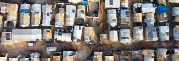

The Regional Economic Communities (RECs) are regional groupings of African states. The 1980 Lagos Plan of Action for the Development of Africa and the 1991 Abuja Treaty proposed the creation of RECs as the basis for wider African integration. Each with their own role and structure, the RECs aim to facilitate regional economic integration between members of the region and through the wider African Economic Community (AEC), established under the Abuja Treaty. They are increasingly involved in coordinating African Union Member States’ interests in wider areas such as peace and security, development and governance. This map shows how many and which RECs each African country belongs to. The African Union recognises eight RECs: the Arab Maghreb Union (UMA), the Common Market for Eastern and Southern Africa (COMESA), the Community of Sahel–Saharan States (CEN–SAD), the East African Community (EAC), the Economic Community of Central African States (ECCAS), the Economic Community of West African States (ECOWAS), the Intergovernmental Authority on Development (IGAD), and the Southern African Development Community (SADC).
Tensions over freshwater use and management in international river basins are one of the main concerns in political relations. They may exacerbate existing tensions, increase regional instability and social unrest. Hydro-political interactions are here defined as episodes of cooperation or conflict between countries over transboundary water resources. The probability index presented in this map is based on past hydro-political issues in international river basins and a selection of biophysical and socioeconomic indicators (for the period 1997-2012). Areas are more (red) or less (blue) likely to experience transboundary water-related issues. A higher likelihood identifies areas where hydro-political interactions are more probable, due to lack of water supply and/or human pressure in a more vulnerable institutional and socioeconomic context. This data driven index can help policy makers identify areas where cooperation over water should be actively pursued to avoid possible tensions, especially under changing environmental conditions.
Droughts affect millions of people in the world each year and have long-lasting socioeconomic impacts. They can occur over most parts of the world, even in wet and humid regions, and can profoundly impact agriculture, basic household welfare, tourism, ecosystems and the services they provide. The Risk of Drought Impact for Agriculture (RDrI-Agri) is a categorized risk index, indicating the probability of having impacts from a drought, with particular focus on vegetation. Higher risk (in red) means that the areas affected will be the most likely to report impacts due to droughts. It is updated every ten days.

The Rule of Law Index, generated by the World Justice Project, illustrates the perceived adherence to the Rule of Law per country. Rule of law is defined here as a durable system of laws, institutions, norms, and community commitment that delivers accountability, just laws, open government, and accessible justice. These principles are measured across eight factors:
The Rule of Law Index aggregate the scores across factors. A high ranking (a low numerical rank) means that perceived adherence to the Rule of Law is higher. 0=weakest, 1=strongest.
This dataset is part of the LEAP-RE project collection. For more information visit https://www.leap-re.eu/
The Sahel is an area that, over time, has had multiple definitions, climatic-botanical and political: its limits have been traced in very different ways. Even the usage of this name and its delimitation on maps has been openly questioned and contested. Our contribution proposes a cartography capable of mapping the incessant movement of conditions, limits and possibilities that characterize this strip between the Sahara and the humid Sudanese regions, rendering the areal definition of the Sahel visible and fluid at the same time. However, it is a question of rethinking the very foundation of cartography – what has been ‘taken for granted’ in the past – such as the common tools of cartographic representation, for example the concept of ‘isohyet’ to identify climatic areas or ‘boundaries’ to define political jurisdictions. Knowledge from fieldwork and expertise in the processing of satellite and geo-referenced data converge in this path of analysis and representation.
The Sahel is an area that, over time, has had multiple definitions, climatic-botanical and political: its limits have been traced in very different ways. Even the usage of this name and its delimitation on maps has been openly questioned and contested. Our contribution proposes a cartography capable of mapping the incessant movement of conditions, limits and possibilities that characterize this strip between the Sahara and the humid Sudanese regions, rendering the areal definition of the Sahel visible and fluid at the same time. However, it is a question of rethinking the very foundation of cartography – what has been ‘taken for granted’ in the past – such as the common tools of cartographic representation, for example the concept of ‘isohyet’ to identify climatic areas or ‘boundaries’ to define political jurisdictions. Knowledge from fieldwork and expertise in the processing of satellite and geo-referenced data converge in this path of analysis and representation. The Sahel is a sub-Saharan area defined between the isohyetal lines of 150mm and 850 mm of rain per year. However, depending on the period, the season and the drought / rain conditions this area moves: hence the definition of the breath of the Sahel. This data represents the minimum and maximum extension of the Sahel area over the last 30 years.
Priority areas are identified using local coefficients estimated through Geographically Weighted Regression (GWR), which measures the spatially varying relationship between access to sanitation infrastructure and health using the indicator of under 5 mortality. The tool highlights locations where the local association between sanitation access and the selected gender indicator is both negative and statistically significant. The identified areas are classified as having strong, moderate, or mild associations according to the magnitude of the local GWR coefficient. This classification helps users determine the appropriate intensity of intervention. The spatially varying coefficients therefore allow users to identify areas where limited sanitation access is most strongly associated with higher child mortality, supporting targeted interventions, programme planning, and place-based development strategies.

Percentage of children in a school attendance age (approximately 3-17 years old depending on the country) that have internet connection at home. Also in this case the indicator relates to the potential educational impact of electrification on children and young people.
Monitoring of sea surface temperature (SST) provides fundamental information on the global climate system and for the study of marine ecosystems. For example, it helps estimating heat stress conducive to coral bleaching, the process by which they expel the symbiotic algae living in their tissues and become white (bleached) and vulnerable. The NOAA Coral Reef Watch's daily global 5km satellite SST Anomaly (SSTA) compares the daily SST value with the long-term mean SST. A positive anomaly (+1.0 °C or more, warm colours) means the daily SST is warmer than the long-term average for that day; a negative anomaly (-1.0 °C or less, cold colours) means it is cooler than the average.
Ocean temperature is related to ocean heat content (the energy absorbed by the ocean), an important topic in the study of global warming. Monitoring of sea surface temperature (SST) from earth-orbiting infrared radiometers has had a wide impact on oceanographic science. It provides fundamental information on the global climate system and for the study of marine ecosystems. For example, it helps estimating heat stress conducive to coral bleaching, the process by which they expel the symbiotic algae living in their tissues and become white (bleached) and vulnerable. The NOAA Coral Reef Watch Daily Global 5km Satellite Sea Surface Temperature product (a.k.a. CoralTemp) measures the night-time ocean temperature at the sea surface, calibrated to 0.2 meters depth.
Monitoring of sea surface temperature (SST) provides fundamental information on the global climate system and for the study of marine ecosystems. For example, it helps estimating heat stress conducive to coral bleaching, the process by which they expel the symbiotic algae living in their tissues and become white (bleached) and vulnerable. The NOAA Coral Reef Watch's daily global 5km 7-day SST Trend product shows the SST trend for the most recent seven days. Pixels coloured in blue to purple follow a cooling trend while pixels coloured in yellow to red follow a warming trend. Pixels coloured in green have insignificant trends.

This layer shows the percentage of children under 5 experiencing severe wasting (in 2019) — the most critical form of acute malnutrition. These children face a significantly higher risk of mortality and require immediate therapeutic support. This indicator helps prioritize emergency nutrition interventions and monitor high-risk areas in need of health and food system strengthening.
The NASA Making Earth System Data Records for Use in Research Environments (MEaSUREs) Shuttle Radar Topography Mission (SRTM) global 1 arc second (~30 metre) DEM is archived and distributed by the Land Processes Distributed Active Archive Center (LP DAAC). This dataset is a result of a collaborative effort by the National Aeronautics and Space Administration (NASA) and the National Geospatial-Intelligence Agency (NGA – previously known as the National Imagery and Mapping Agency, or NIMA), as well as the participation of the German and Italian space agencies. The primary goal of creating this dataset was to eliminate voids that were present in earlier versions of the SRTM elevation data. Africa Knowledge Platform provides free and open access to the NASA Version 3 SRTM DEM product over Africa.
In most people's mind, soil would not figure highly in a list of the natural resources of Africa. However, healthy and fertile soils are the cornerstones of food security, key environmental services, social cohesion and the economies of most African countries. Unfortunately, soil in Africa tends to reach public awareness only when it fails – often with catastrophic consequences as seen by the famine episodes of the Sahel in the 1980s and more recently in Niger and the Horn of Africa. In the context of major global environmental challenges such as food security, climate change, fresh water scarcity and biodiversity loss, the protection and the sustainable management of soil resources in Africa are of paramount importance. This layer presents the diversity of soil types across Africa. This map was produced by the Joint Research Centre of the European Commission for the Soil Atlas of Africa.
Agricultural drought events can affect large regions across the world. Soil moisture (or soil water content) is an important variable for plant growth, and - together with precipitation and evapotranspiration - is a basic component of the hydrological cycle. The Soil Moisture Anomaly (SMA) indicator is used to detect and monitor agricultural drought, that is when there is reduced crop production due to insufficient soil moisture. It is computed as a deviation from the climatological reference period, and is updated 3 times a month (after the 10th, the 20th and the last day of the month). This layer displays the map for the last full decade of the current month. Negative anomalies (shades of brown) represent dry conditions.
Soil organic carbon (SOC) is the carbon that remains in the soil after partial decomposition of any material produced by living organisms. It constitutes a key element of the global carbon cycle through atmosphere, vegetation, soil, rivers and the ocean. It is a crucial contributor to food production, mitigation and adaption to climate change. Soils represent the largest terrestrial organic carbon reservoir. Depending on local geology, climatic conditions and land use and management (amongst other environmental factors), soils hold different amounts of SOC. This map shows the amount of carbon stored in the soil (from 0 to 30 cm depth), expressed in Mg (megagrams or tonnes) per km2.
African countries have an evident potential for solar energy. Knowing the amount of solar radiation reaching the earth's surface is of particular interest for photovoltaic installations. It can be represented by the Global Horizontal Irradiation: the total amount of energy received from the Sun by a surface horizontal to the ground during a period of time, expressed in Wh/m2. This map shows the yearly average (2005-2015) global horizontal irradiation (kWh/m2).

The availability and quantity of observational species occurrence records have greatly increased due to technological advancements and the rise of online portals, such as the Global Biodiversity Information Facility (GBIF), coalescing occurrence records from multiple datasets. Funded by the world's governments, this international network and data infrastructure is aimed at providing anyone, anywhere, open access to data about all types of life on Earth. This map displays all the observations reported to the GBIF from 1600 to present. This knowledge derives from many sources, including everything from museum specimens collected in the 18th and 19th century to geotagged smartphone photos shared by amateur naturalists in recent days and weeks. Individual records are available at https://www.gbif.org
Droughts affect millions of people in the world each year and have long-lasting socioeconomic impacts. They can occur over most parts of the world, even in wet and humid regions, and can profoundly impact agriculture, basic household welfare, tourism, ecosystems and the services they provide. The Standardized Precipitation Index (SPI) is the most commonly used indicator worldwide for detecting and characterizing meteorological droughts, which are prolonged periods of less than average rainfall in a given region. It measures precipitation anomalies at a given location, based on a comparison of observed total precipitation amounts for an accumulation period of interest (in this case, 3 months), with the long-term rainfall record for that period. SPI values below ‒1.0 indicate rainfall deficits (drier than normal – yellow to red), while SPI values above 1.0 indicate excess rainfall (wetter than normal – purple to blue). The lower the SPI, the more intense is the drought. The layer show the SPI-3 from the month second to last and is updated monthly.
This layer shows the percentage of stunting among children under 5 years of age, a form of chronic undernutrition reflected in low height-for-age. Stunting can result from prolonged food insecurity, poor maternal health, or inadequate early childhood care. Areas with high stunting rates indicate long-term development challenges and can help guide interventions aimed at improving nutrition, health services, and water and sanitation infrastructure.
The Africa Surficial Lithology layer maps the geology of Africa into 20 classes based on the bedrock type and the distribution of unconsolidated surface material. It shows the distribution of the key geological features that affect the distribution of plants and ecosystems in Africa.
Critical natural assets are defined as the natural and semi-natural terrestrial and aquatic ecosystems required to maintain 12 of nature’s ‘local’ contributions to people (local NCP) on land. 12 Local NCP for key benefits like security in food, water, hazards, material and culture. as follows: for food, pollinator habitat sufficiency ofr pollination dependent crop production, fodder production for livestock, wild riverine and marine fish catch ; for water, water quality regulation, via sediment retention and nutrient retention; for natural hazards, flood risk reduction and coastal risk reduction. For materials, timber production, fuelwood production and access to nature. For cultural benefits, coral reef tourism and access to nature for recreation or other uses. Criticality of the natural assets was defined on the basis of the highest value areas across all NCPs, the magnitude of benefits and the number of beneficiaries. Cropland, urban areas, bare areas and permanent snow and ice are excluded from the analysis.
The RESOLVE Ecoregions dataset, updated in 2017, offers a depiction of the 846 terrestrial ecoregions that represent our planet.
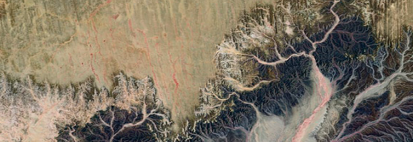
Organisms and non-living elements of the environment such as climate, soil, and water are connected through the movement of nutrients and energy in ecosystems. Ecosystems represent specific areas where organisms and environmental conditions create a network of interactions and are affected by forces such as disturbance (temporary change in environmental conditions that causes a pronounced change) and succession (process of change in the species structure of an ecological community over time). This layer maps the Ecosystems of Africa, based on Africa's climate regions, topography and lithology (bedrock), with a 100m spatial resolution.
This map provides a spatially explicit characterization of 47 terrestrial habitat types, as defined in the International Union for Conservation of Nature (IUCN) habitat classification scheme, which is widely used in ecological analyses, including for quantifying species’ Area of Habitat. The map broadens our understanding of habitats globally, assist in constructing area of habitat refinements, and are relevant for broad-scale ecological studies and future IUCN Red List assessments. Periodic updates are planned as better or more recent data becomes available.
This map provides a spatially explicit characterization of 47 terrestrial habitat types, as defined in the International Union for Conservation of Nature (IUCN) habitat classification scheme, which is widely used in ecological analyses, including for quantifying species’ Area of Habitat. The map broadens our understanding of habitats globally, assist in constructing area of habitat refinements, and are relevant for broad-scale ecological studies and future IUCN Red List assessments. Periodic updates are planned as better or more recent data becomes available.
Development test dataset: random 0-100 values on the 0.35° Nature Africa grid clipped to the DRC. Not real data.

Average time spent by households on fuel collection daily. The higher the number of daily hours that households spend in collecting fuel, the higher the improvements in the quality of life of communities due to electricity access.

The Africa Topographic Moisture Potential layer classifies the landscape of Africa as either upland or lowland (and other depressions) area. It was produced as part of the USGS’s Africa Ecosystems Mapping project to create maps depicting standardized, terrestrial ecosystem models. Substrate moisture regimes strongly influence the differentiation and distribution of terrestrial ecosystems, and therefore topographic moisture potential is one of the key input layers in this biophysical stratification.
Carbon storage in biomass (biological material) is a key link in the global carbon cycle, and consequently for climate change mitigation. Forests in particular are an important carbon sink that help reduce the greenhouse effect. Together, the above-ground carbon (carbon fraction contained in the stems, barks, branches and twigs of living trees), the belowground biomass carbon (carbon fraction contained in roots of living trees) and the soil organic carbon (amount of carbon stored in the soil) provide a complete overview of the total carbon stored in forest areas (trees and soil). This map shows the total carbon stored expressed in units of dry mass (Mg) per ground area unit (km2).

The global capture fisheries has increased over the last 50 years as the consumption of seafood has doubled.This has increased pressure on fish stocks across the world. According to the State of World Fishery and Aquaculture 2020(FAO), the global capture fisheries production rose 14% from 1990 to 2018 and in 2018 it reached 96.4million tonnes. Here we show how much wild fish African countries caught in their EEZ in the last ten years (tonnes). In the attribute table you can find how much of the threatened marine fish species had be legally caught

The world is shrinking. Cheap flights, large scale commercial shipping and expanding road networks all mean that we are better connected to everywhere else than ever before. Accessibility - whether it is to markets, schools, hospitals or water - is a precondition for the satisfaction of almost any economic need. The new map of Travel Time to Major Cities -developed by the European Commission and the World Bank- captures this connectivity and the concentration of economic activity. It also highlights that there is little wilderness left. The map shows the travel time (in hours/days) to major cities (i.e. cities of 50,000 or more people in year 2000) using land (road/off road) or water (navigable river, lake and ocean) based travel.
Forests worldwide are in a state of flux, with accelerating losses in some regions and gains in others. Given the recognized importance of forest ecosystem services, quantification of global forest extent and change is needed. This map displays the tree cover in the year 2000. Tree cover is defined as canopy closure for all vegetation taller than 5m in height and is expressed as a percentage per output grid cell, in the range 0–100.
Forests worldwide are in a state of flux, with accelerating losses in some regions and gains in others. Given the recognized importance of forest ecosystem services, quantification of global forest extent and change is needed. This map displays the forest gain during the period 2000–2018. Forest gain is defined as the inverse of loss, or a change from non-forest to forest entirely within the study period. It is expressed as either 1 (gain) or 0 (no gain).

Forests worldwide are in a state of flux, with accelerating losses in some regions and gains in others. Given the recognized importance of forest ecosystem services, quantification of global forest extent and change is needed. This map displays the forest loss during the period 2000–2018, defined as a stand-replacement disturbance, or a change from forest to non-forest state. It is expressed as either 1 (loss - in red) or 0 (no loss).
Forests are the most biologically diverse land ecosystems and are critical for sustaining local and global livelihoods. Deforestation can be considered a type of land degradation when forest ecosystems, with all of their important provisioning, regulating and cultural services, are exchanged for another land use, such as crop agriculture, with a narrow provisioning service focus. Damages to the land resource include the immediate reduction or loss of biomass productivity with a linked loss in habitat, biodiversity, and carbon stock. Clearance of natural forests accelerates soil erosion and the alteration of soil functioning. This layer displays the areas of concern for tree loss issues, derived from the convergence of global evidence of human-environment interactions that can have consequences on land degradation.

Tropical moist forests have a huge environmental value. They play an important role in biodiversity conservation, terrestrial carbon cycle, hydrological regimes, indigenous population subsistence and human health (1-5). They are increasingly recognized as an essential element of any strategy to mitigate climate change. Deforestation, and degradation compromise the functioning of tropical forests as an ecosystem, lead to biodiversity loss and reduced carbon storage capacity. Deforestation and fragmentation are increasing the risk of virus disease outbreaks. This map shows where deforestation occurred in the last three decades (between 1982 and 2020) and the year when the forest cover has been deforested for the first time (followed or not by a regrowth).
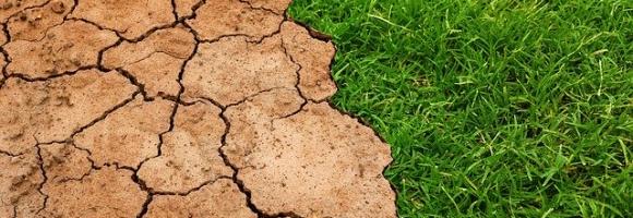
Tropical moist forests have a huge environmental value. They play an important role in biodiversity conservation, terrestrial carbon cycle, hydrological regimes, indigenous population subsistence and human health (1-5). They are increasingly recognized as an essential element of any strategy to mitigate climate change. Deforestation, and degradation compromise the functioning of tropical forests as an ecosystem, lead to biodiversity loss and reduced carbon storage capacity. Deforestation and fragmentation are increasing the risk of virus disease outbreaks. This map shows where degradation occurred in the last three decades (between 1982 and 2020) and the year when the forest has been degraded for the first time (and remained degraded up to 2020).
Tropical moist forests have a huge environmental value. They play an important role in biodiversity conservation, terrestrial carbon cycle, hydrological regimes, indigenous population subsistence and human health (1-5). They are increasingly recognized as an essential element of any strategy to mitigate climate change. Accurate characterization of the tropical moist forests changes is needed to support conservation policies and to better quantify their contribution to global carbon fluxes. The transition map captures the dynamics of changes in tropical moist forests between the initial observation period (1990) and the end of the year 2020.
Tropical moist forests have a huge environmental value. They play an important role in biodiversity conservation, terrestrial carbon cycle, hydrological regimes, indigenous population subsistence and human health (1-5). They are increasingly recognized as an essential element of any strategy to mitigate climate change. Accurate characterization of the tropical moist forests changes is needed to support conservation policies and to better quantify their contribution to global carbon fluxes. This map shows the coverage of undisturbed tropical moist forests remaining at the end of the year 2019.
This dataset provides estimates of the total number of under-5 children per grid cell, for Uganda. The data come from the WorldPop R2025A, version v1 release. The dataset is available in GeoTIFF format at a spatial resolution of 30 arc-seconds (approximately 1 km at the equator). All layers use the WGS84 Geographic Coordinate System.

This layer shows the estimated number of deaths per 1,000 live births among children under 5 years of age (in 2017) — a key indicator of child survival and overall health system performance. High under-5 mortality rates often reflect limited access to essential health services, clean water, sanitation, and adequate nutrition. Expanding decentralized systems can play a key role in improving child survival outcomes in underserved areas.

Percentage of undernourished people. The higher the incidence of undernourished people the more beneficial decentralised renewable energy solutions may be, in terms of improving both cooking facilities within households and agricultural productivity with positive impacts on nutrition. Thus electricity can be used to make agricultural practices more efficient and refrigerate food produce to store for longer.

This layer shows the percentage of children under 5 years of age (in 2019) who are underweight, based on low weight-for-age. Underweight is a composite indicator capturing both chronic and acute undernutrition. It is useful for identifying vulnerable populations and informing multisectoral strategies to improve child health, food access, and caregiving practices.

Prevalence of underweight (weight-for-age <-2 standard deviation from the median of the World Health Organization (WHO) Child Growth Standards) among children under 5 years of age. Survey estimates are based on standardized methodology using the WHO Child Growth Standards. Global and regional estimates are based on methodology outlined in UNICEF-WHO-The World Bank: Joint child malnutrition estimates - Levels and trends (UNICEF/WHO/WB 2012).
Africa is projected to have the fastest urban growth rate in the world — by 2050, Africa’s cities will be home to an additional 950 million people. Urban planning and management are essential development challenges. Understanding urbanisation, its drivers, dynamics and impacts, is key to designing targeted, inclusive and foward-looking policies at the local, national and continental levels. Africapolis data and evidence supports cities and governments to make urban areas more inclusive, productive and sustainable. This map of urban population covers 7 500 agglomerations in 50 countries for the base year 2015.
This layer represents the estimated travel time (in hours) by foot to the nearest healthcare facility. The underlying methodology is described in Weiss et al. (2020), which leverages major data collection efforts from OpenStreetMap, Google Maps, and academic sources to compile the most comprehensive global inventory of healthcare facility locations to date. The approach is based on the creation of friction surfaces that quantify the time required to traverse each ~1 km × 1 km pixel of the Earth's surface.
This layer represents the estimated travel time (in hours) by foot to the nearest primary school. The accessibility map is generated using a well-established geospatial methodology that integrates road and rail networks, land cover, and topographic features. The resulting gridded "friction surface" represents the time required to traverse each ~1 km × 1 km pixel of Africa.
This layer shows the prevalence of wasting among children under 5 years of age (in 2019), a sign of acute undernutrition indicated by low weight-for-height. Wasting reflects recent and severe weight loss, often caused by food shortage, infection, or crisis conditions. Mapping areas with high wasting rates can help target urgent humanitarian and nutrition assistance.

Priority areas are identified using local coefficients estimated through Geographically Weighted Regression (GWR), which measures the spatially varying relationship between access to piped water and four nutrition indicators among children under five: stunting, wasting, severe wasting, and underweight.
The tool highlights locations where the local association between piped water access and the selected nutrition indicator is both negative and statistically significant. In this application, priority areas are further restricted to locations where piped water access is below 80%, ensuring that the results remain relevant for policy intervention.
The identified areas are classified as having strong, moderate, or mild associations according to the magnitude of the local GWR coefficient. This classification helps users determine the appropriate intensity of intervention. The spatially varying coefficients therefore allow users to identify areas where limited piped water access is most strongly associated with poorer nutritional outcomes among children under five, supporting targeted interventions, programme planning, and place-based development strategies.
Priority areas are identified using local coefficients estimated through Geographically Weighted Regression (GWR), which measures the spatially varying relationship between access to Water infrastructure and education using the indicator of percentage of population with secondary education. The tool highlights locations where the local association between access to piped water s and the selected education indicator is both negative and statistically significant. The identified areas are classified as having strong, moderate, or mild associations according to the magnitude of the local GWR coefficient. This classification helps users determine the appropriate intensity of intervention. The spatially varying coefficients therefore allow users to identify areas where limited sanitation access is most strongly associated with lower education, supporting targeted interventions, programme planning, and place-based development strategies.
Priority areas are identified using local coefficients estimated through Geographically Weighted Regression (GWR), which measures the spatially varying relationship between access to water infrastructure and gender using the indicator of percentage of women with secondary education. The tool highlights locations where the local association between access to piped water and the selected gender indicator is both negative and statistically significant. The identified areas are classified as having strong, moderate, or mild associations according to the magnitude of the local GWR coefficient. This classification helps users determine the appropriate intensity of intervention. The spatially varying coefficients therefore allow users to identify areas where limited water access is most strongly associated with lower women education, supporting targeted interventions, programme planning, and place-based development strategies.
Priority areas are identified using local coefficients estimated through Geographically Weighted Regression (GWR), which measures the spatially varying relationship between access to water infrastructure and health using the indicator of under 5 mortality. The tool highlights locations where the local association between access to piped water and the selected health indicator is both negative and statistically significant. The identified areas are classified as having strong, moderate, or mild associations according to the magnitude of the local GWR coefficient. This classification helps users determine the appropriate intensity of intervention. The spatially varying coefficients therefore allow users to identify areas where limited access to piped water is most strongly associated with higher child mortality, supporting targeted interventions, programme planning, and place-based development strategies.
Surface water affects many aspects of our world: the exchange of heat, gas and water vapour between the planet's surface and atmosphere. Water is the engine behind the distribution, movement and migration of Earth's plant and animal life and is just as essential for humans. It affects our capacity to grow crops and manage animal grazing lands, to run our industrial processes, to manufacture goods, it influences the movement of disease-vectors, toxins and pollutants, it generates energy directly (hydroelectric) and indirectly (thermoelectric), it is an essential part of our transport network, and forms part of our recreational, cultural and sporting world. The Water Occurrence dataset shows where surface water occurred between 1984 and 2018. Open water is any stretch of water open to the sky, and includes both freshwater and saltwater. The map displays water surfaces greater than 30m2 that are visible from space, including natural (rivers, lakes, coastal margins and wetlands) and artificial water bodies (reservoirs formed by dams, flooded areas such as opencast mines and quarries, flood irrigation areas such as paddy fields, and water bodies created by hydro-engineering projects such as waterway and harbour construction). This product captures both the intra and inter-annual variability and changes. The permanent water surfaces (100% occurrence over 36 years) are represented in blue, and areas where water sometimes occurs are shown in shades of pink to purple (0% < occurrence < 100%). The paler shades are areas where the water occurs less frequently. The map can support better informed water-management decision-making.
Water is a critical natural resource for both natural ecosystems and human subsistence. Some of the most immediate pressures on land that lead to degradation include diversion of surface waters and the removal of groundwater reserves to meet agricultural, industrial and domestic demands. This layer displays the areas of concern for water use related issues derived from the convergence of global evidence of human-environment interactions that can have consequences on land degradation. It highlights areas where the total water withdrawal (by the agriculture, industrial and domestic sectors) exceeds 40% of the total available annual renewable water supply.
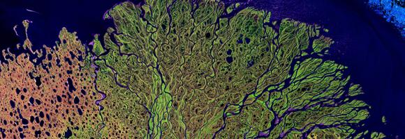
Water is essential for life on Earth and a critical natural resource that underpins all social and economic activity. Ensuring water and sanitation for all is one of the Sustainable Development Goals (SDG 6) of the 2030 Agenda. Target 6.6 specifically aims to protect and restore water-related ecosystems, including wetlands. This map shows the total area covered by inland vegetated wetlands. It includes swamps, marshes, peatlands, bogs and fens, the vegetated parts of floodplains as well as rice paddies and flood recession agriculture.
Where are the best places to spot the most requested wildlife-watching species? This grid layer presents a richness index of top wildlife watching species/groups, including rhinos, elephants, lions, leopards, buffalos, giraffes, lowland and mountain gorillas, chimpanzees, bonobos, sifakas, ringtails, aye-aye, mouse lemurs and colobus.
The Global Wind Atlas is a free, web-based application developed to help policymakers, planners, and investors identify high-wind areas for wind power generation. It also serves as a useful tool for governments to get a better understanding of their wind resource potential at provincial and local levels. Wind power density is a measure of the wind resources. This map shows the mean wind power density (W/m2) at 10 m heigth. Higher mean wind power densities indicate a better wind resource potential.
The working poor are employed people who live in households that fall below an accepted poverty line. While poverty in the developed world is often associated with unemployment, the extreme poverty that exists throughout much of the developing world is largely a problem of employed persons. For these poor workers, the problem is typically one of employment quality. Reducing poverty in line with the SDGs therefore necessitates boosting the employment opportunities and incomes of the working poor – those people who are employed, but who are nevertheless unable to lift themselves and their families above the poverty threshold. This map shows for each country the proportion of employed people who live on less than $3.10 a day (in Purchasing Power Parity (PPP) terms), expressed as a percentage of the total employed population aged 15 and older.
This dataset represents a geographic clip to Africa of the World Database on Protected Areas (WDPA), which is the authoritative and most complete global dataset on terrestrial and marine protected areas. The parent database is a joint initiative between the UN Environment Programme (UNEP) and the International Union for Conservation of Nature (IUCN), managed by the UNEP World Conservation Monitoring Centre (UNEP-WCMC). Information is submitted and verified by international secretariats, national and regional governments, NGOs, communities, and landowners.
This spatial dataset has been specifically filtered and clipped to include only protected areas located within the terrestrial and marine boundaries of the African continent and its associated island nations.
The dataset comprises both spatial data (GIS boundaries) and attribute data (descriptive information) for protected sites across Africa. Key attributes include site name, designation type (national, regional, or international), governance model, IUCN management category, marine/terrestrial status, and legal establishment date.
The WDPA is the primary global mechanism used to track progress toward international area-based conservation targets. This African subset is widely used across various sectors for:
The global WDPA dataset is updated and released on a monthly basis through the Protected Planet platform. This clip was extracted on May 2026.